drawing, ink, engraving
#
drawing
#
baroque
#
pen drawing
#
form
#
ink line art
#
ink
#
geometric
#
line
#
decorative-art
#
engraving
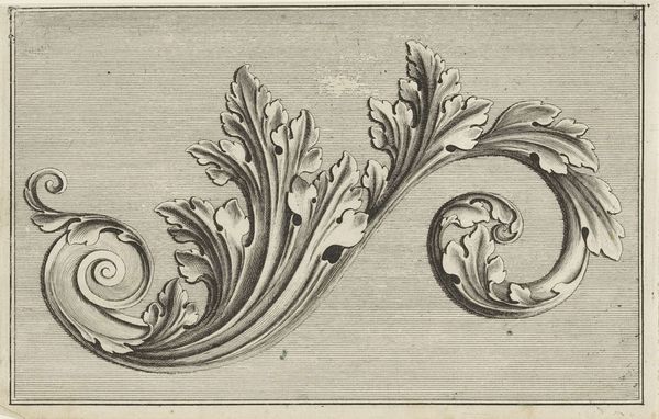
Dimensions: height 148 mm, width 232 mm
Copyright: Rijks Museum: Open Domain
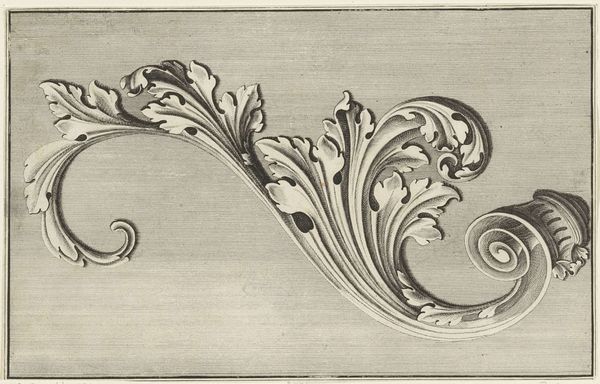
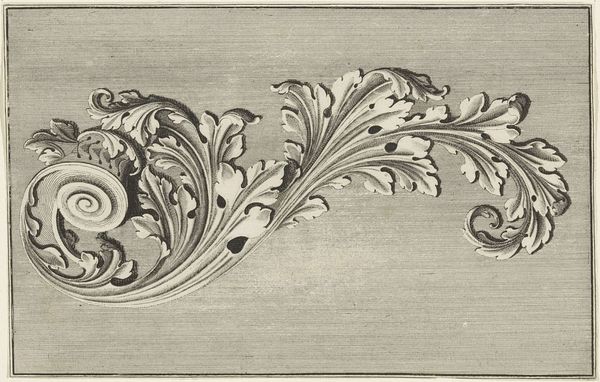
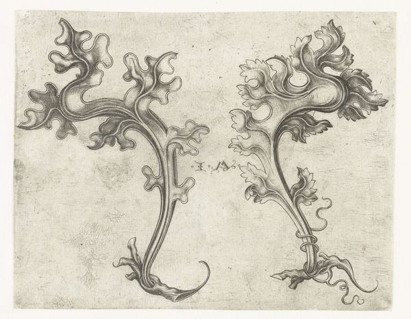
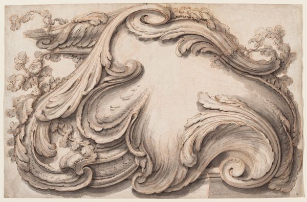
Editor: Here we have "Twee gestileerde acanthusbladeren," or "Two Stylized Acanthus Leaves," an ink and pen drawing from the early 18th century by an anonymous artist, housed at the Rijksmuseum. The precision of the lines is striking; the contrast between the black ink and the background makes the leaves seem almost three-dimensional. How would you interpret this piece from a formalist perspective? Curator: The primary focus, predictably, lands on the manipulation of form and line. The acanthus leaf, a motif frequently deployed in classical architecture, here undergoes a deliberate stylization. Observe how the artist uses line weight to create depth, suggesting a sculptural relief. The engraving medium itself dictates a certain visual language, prioritizing precise articulation and a linear mode of representation. Consider, too, the balance achieved between organic forms and geometric structures within the overall composition. Where does your eye naturally travel, and why? Editor: My eye jumps between the curling spirals and the sharp edges of the leaves. They seem to be in conversation with each other, contrasting yet harmonious. It almost feels like a dance. Curator: Precisely. The rhythmic interplay of curves and angles establishes a visual cadence. Furthermore, consider the density of the lines in certain areas versus the relative openness in others. This creates a hierarchy, drawing our attention to specific points within the design. We see not simply a representation of leaves but rather a structured investigation of visual elements. What do you make of the use of repetition in the shape of the leaves themselves? Editor: The repetition almost abstracts the leaves, pushing them away from purely representational and closer to pure pattern. I guess I see it now as less about nature and more about the artist exploring form itself. Curator: Precisely. In foregrounding these formal relationships—line, shape, texture, balance—the artwork reveals its inherent structure and design logic. The artwork underscores that form, rather than mimetic representation, possesses intrinsic aesthetic value. Editor: I came in thinking of this as botanical illustration, but now I understand the rigorous attention to line and form and its own statement on visual language. Thanks for showing me the importance of intrinsic form!
Comments
No comments
Be the first to comment and join the conversation on the ultimate creative platform.
More like this