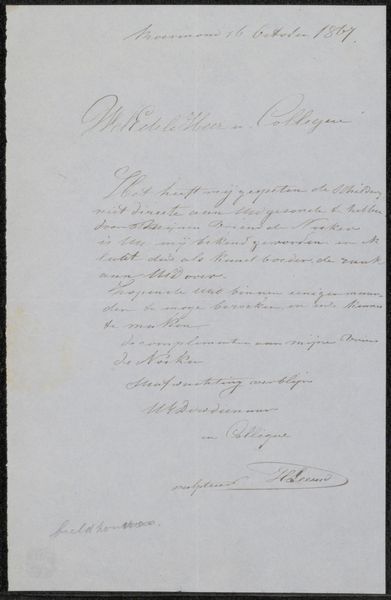
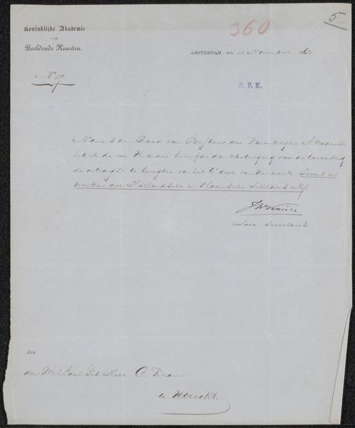
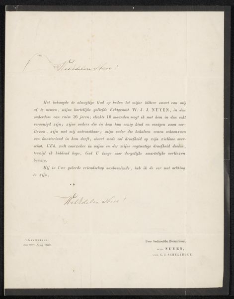
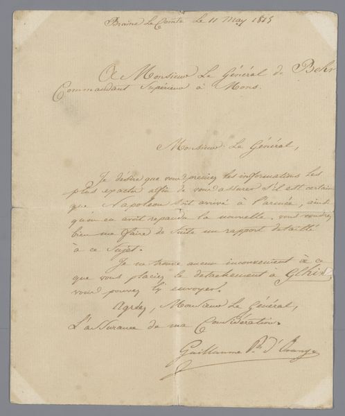
Benoeming van J.D.B. Wilkens tot Ridder in de Orde van de Eikenkroon (Chevalier Ordre de la Couronne de Chêne), 6 december 1843 Possibly 1843
0:00
0:00
drawing, print, paper
#
drawing
# print
#
paper
#
calligraphy
Dimensions: height 350 mm, width 225 mm
Copyright: Rijks Museum: Open Domain
Editor: Here we have "Appointment of J.D.B. Wilkens as Knight in the Order of the Oak Crown, December 6, 1843," presumed to be from 1843, a print on paper showcasing elegant calligraphy. What strikes me is the contrast between the crisp, official language and the almost fragile nature of the document itself. What catches your eye? Curator: Indeed. Focusing on form, the calligraphic lines delineate distinct textual blocks, creating a visual hierarchy. Notice how the upper section employs a more assertive typeface announcing royal authority, while the body text assumes a more delicate, flowing hand, emphasizing the personalized honor being bestowed. The paper itself acts as a field, its off-white hue intensifying the starkness of the black ink. The seal at the bottom serves to ground the visual elements. Are you attuned to the role of negative space in the composition? Editor: I hadn't considered that, but I see what you mean. The blank areas aren't just empty; they give the script room to breathe, adding to the overall sense of formality. It’s not just what’s written, but also how it’s presented that conveys importance. Curator: Precisely. And the subtle variations in line thickness within the calligraphy animate the static surface. Observe how each stroke contributes to a larger pattern, almost like an abstract design coexisting with the text's denotative function. Even what might be seen as imperfections in the inking become part of the visual texture. What overall effect does this generate, would you suggest? Editor: I’d say it suggests careful attention to detail, making the honor seem all the more precious and significant. It goes beyond just the words; it’s in the presentation. It feels like a physical manifestation of respect. Curator: Yes, quite. The interplay between the linguistic content and the visual construction results in a powerful articulation of status and recognition. The materiality and its organization become inseparable from the document’s core function. Editor: Thank you. It’s helpful to consider all these elements and appreciate how much the visual design contributes to the message.
Comments
No comments
Be the first to comment and join the conversation on the ultimate creative platform.
More like this