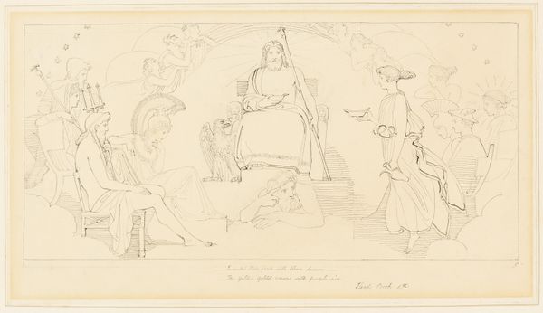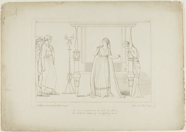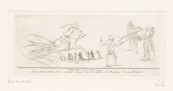
n.d.
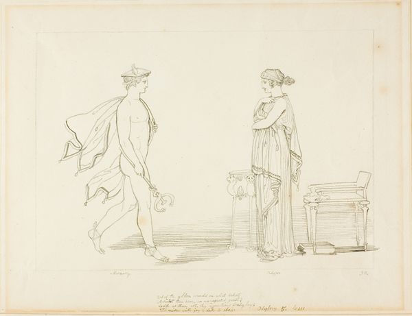
Minerva and Achilles
Listen to curator's interpretation
Curatorial notes
Editor: Here we have John Flaxman's "Minerva and Achilles," an ink and graphite drawing of undetermined date, presently housed at the Art Institute of Chicago. It's quite stark, almost severe, in its lines. How do you interpret this work formally? Curator: The emphasis on line is paramount. Note how Flaxman uses a spare, almost clinical, application of line to define form. Observe the neoclassicism. This recalls Flaxman's engagement with classical sculpture, evident in the stoic rendering of figures such as Minerva and Achilles. Note how outlines delineate the figures and objects, foregoing any illusionistic concerns of volume. Editor: I see what you mean about the outlines creating shapes more than forms, and how that speaks to neoclassicism's revival of earlier, classical works. It's like the figures are types, not individuals. What do you make of that choice? Curator: Indeed. By flattening the figures and utilizing a minimal approach, Flaxman redirects our attention towards the foundational elements of art itself: line, shape, and the distribution of forms on the page. Observe also how the composition directs the eye, moving from left to right across the depicted narrative. Do you perceive any significant focal points arising from these structural arrangements? Editor: Yes, Minerva, intervening with the sword, is centrally placed and pops, so to speak, given her action. It certainly keeps your attention. I had initially missed that she was the focus. I had wrongly centered on Achilles. Thank you for that insight. Curator: Precisely. Her intervention serves as the visual fulcrum. By restricting tonal variation, Flaxman stresses the fundamental components, thus prioritizing an intellectual response above the emotional. Editor: It’s remarkable how much a drawing with so little shading can convey. Curator: The simplicity underscores the profoundness achievable through formal restraint and conscious composition. A good reminder of structure and careful mark-making!