Copyright: Fernand Leduc,Fair Use
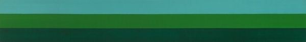
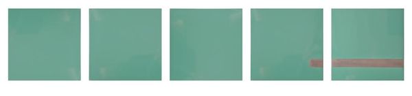
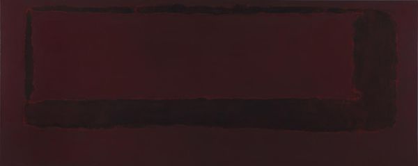
Editor: This is Fernand Leduc’s “Microchromie vert-terre,” created in 1971 using acrylic paint. It's… overwhelmingly green. Honestly, at first glance, it just looks like a single block of color. What can we make of it? Curator: Well, let's consider the material conditions. Acrylic paint, by the '70s, allowed for large, uniform surfaces like this. The smoothness wasn't about illusion, but about the reality of the manufactured pigment itself. How does that impact your reading of the work? Editor: I see… so it’s not necessarily about *representing* a green field, but about *presenting* green *as* material? Does that make sense? Like highlighting the industrial process? Curator: Exactly! And consider the title. “Microchromie.” It suggests a close examination of color itself, a breaking down of its constituent parts. The green becomes an object of study. Do you think the flatness is alienating or inviting? Editor: Maybe both? It’s very detached, unemotional even. The title, with 'Microchromie' suggests scientific analysis, which makes the painting seem less… artistic. I hadn’t considered the role of industrial manufacturing. Curator: Right, it prompts questions about art's role in a consumer society. Leduc’s choice isn't just about aesthetics; it’s about making visible the physical stuff art is made of and the labour behind it. Editor: I guess I was too focused on the visual experience without thinking about the bigger picture: how it was produced, where it fits into society. I will have to research about Leduc now. Thank you! Curator: Likewise. Thinking materially brings us closer to the art.
Comments
No comments
Be the first to comment and join the conversation on the ultimate creative platform.
More like this