drawing, graphic-art, print, ink, engraving
#
drawing
#
graphic-art
#
baroque
# print
#
old engraving style
#
ink
#
engraving
Dimensions: height 205 mm, width 146 mm
Copyright: Rijks Museum: Open Domain
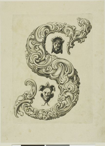
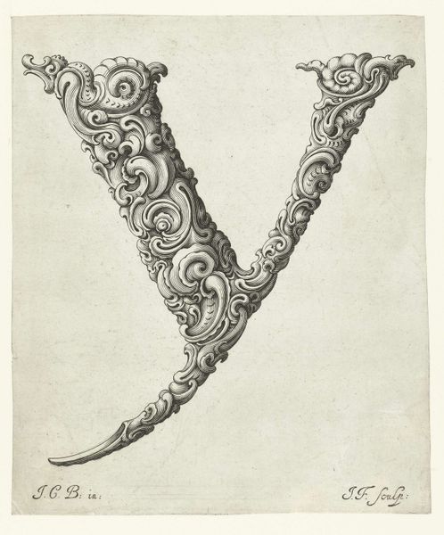
Editor: This is "Letter S," a baroque print by Jeremias Falck, dating back to the mid-17th century. The intricate swirls and flourishes forming the letter are really striking, but also a bit overwhelming. How do you interpret this work? Curator: The "S," so fundamental to language, is here transformed into a visual spectacle. Think of it less as a mere letter and more as a vessel overflowing with cultural memory. Consider the Baroque period: this was an era of drama, ornate detail, and powerful symbolism, a period where even something as simple as a letter was used as an expression of wealth and influence. The swirls and curves – what do they remind you of? Editor: Hmm, maybe foliage, or… waves? Curator: Exactly! And what might foliage and waves, rendered with such deliberate complexity, represent? They become symbols, laden with associations of growth, nature's abundance, even the power and unpredictability of the sea. The "S," therefore, could subtly allude to the flourishing trade routes that shaped the Baroque world. The letter then becomes a symbol that unlocks trade, power and knowledge. What are your thoughts? Editor: That’s fascinating. I was initially just taken by the ornate design, but now I see how much deeper the meaning goes. It’s like the artist is embedding entire worlds within the lines of a single letter. Curator: Precisely! It reveals how seemingly simple forms can become potent containers of cultural and psychological weight, echoing through the ages.
Comments
No comments
Be the first to comment and join the conversation on the ultimate creative platform.
More like this