drawing, painting, watercolor
#
drawing
#
water colours
#
painting
#
watercolor
#
academic-art
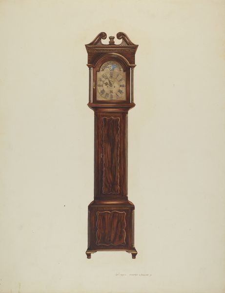
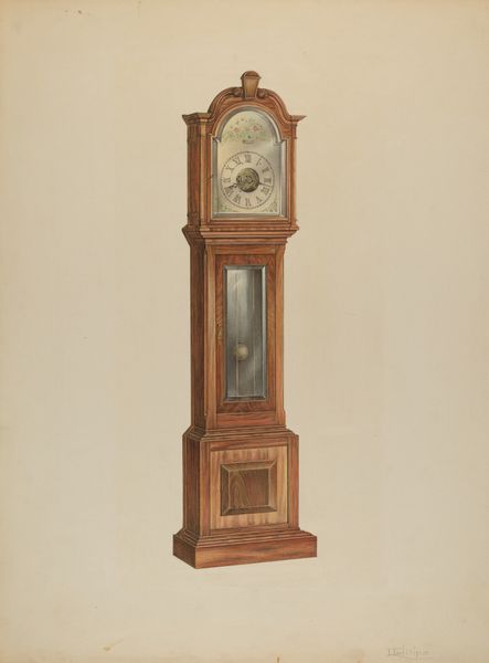
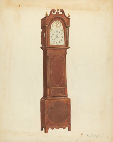
Dimensions: overall: 35.5 x 26.7 cm (14 x 10 1/2 in.) Original IAD Object: 90" x 17" x 11"
Copyright: National Gallery of Art: CC0 1.0
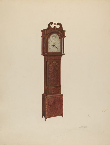
Curator: Let’s turn our attention to this lovely watercolor drawing, believed to be from around 1940. It's simply titled *Grandfather Clock*, and the artist is Cornelius Christoffels. Editor: My first thought is "austere." The clock commands attention, solitary on what looks like bare paper. The washes of color define form meticulously, but without warmth. It's…precise. Curator: Indeed. Grandfather clocks, in their own right, are emblems of domesticity. They’re fixtures, often passed down, linking generations to a specific rhythm of daily life. Christoffels' clock isn't simply marking time, it’s acting as a sentinel. It has psychological heft. Editor: I agree that this watercolor does offer a heightened perception of time. It uses the classical aesthetic principle that art must look “real," which means using shape, lines, texture and colors and the right proportional size on flat picture-plane space. How might the visual structure encourage reflection here? Curator: Well, a clock symbolizes our inevitable passage through life. The rhythmic tick becomes a kind of heartbeat, reminding us of our mortality. The choice of a clock can underscore themes of tradition, inheritance, and even a confrontation with one's own temporal existence. Notice the details Christoffels captures, perhaps remnants of a time that held a reverence for handcrafted objects. The clock serves as a container of ancestral knowledge. Editor: The formal, almost diagrammatic depiction subverts that warmth. Notice the exacting details of the veneer, the subtle gradations creating three-dimensionality. Yet, the surrounding space is empty, flattening any narrative possibility. Does the painting offer more clarity about temporal and perceptual change as the light shines on its shape, colors and textural surfaces? The precision suggests something outside simple sentimentality. Curator: I perceive sentimentality, perhaps the kind attached to heirlooms, rather than individual experience. This might relate to broader social anxieties about lost tradition, where mass-produced goods replaced the handcrafted with its implied labor and stories, which would make this drawing all the more poignant. Editor: I appreciate that sentiment, I find in the work primarily a commitment to objective visual facts. The choice to use watercolor as well may point to transparency or direct observation that allows more space for understanding how color relationships and lines make a form visible. Curator: We both see the temporal in this piece, it just seems that we are looking in the sands of time from different directions. It would seem time always leaves room for alternative interpretations. Editor: And ultimately makes sure to include different perspectives.
Comments
No comments
Be the first to comment and join the conversation on the ultimate creative platform.
More like this