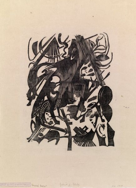
Ontwerp voor band en rug van: Alexander Cohen, Van anarchist tot monarchist, 1936 1934 - 1936
0:00
0:00
drawing, graphic-art, print, typography, woodcut, poster
#
portrait
#
art-deco
#
drawing
#
graphic-art
#
toned paper
#
hand-lettering
# print
#
old engraving style
#
hand drawn type
#
hand lettering
#
personal sketchbook
#
typography
#
hand-drawn typeface
#
pen-ink sketch
#
woodcut
#
abstraction
#
sketchbook drawing
#
poster
#
sketchbook art
Dimensions: height 245 mm, width 244 mm
Copyright: Rijks Museum: Open Domain
Curator: This intriguing graphic work is titled "Ontwerp voor band en rug van: Alexander Cohen, Van anarchist tot monarchist, 1936." It’s attributed to Leo Gestel, and was created between 1934 and 1936. It appears to be a design proposal for a book cover. Editor: It’s quite striking. The stark contrast of black ink against the toned paper, coupled with the bold typography, creates a really assertive visual impact. Almost feels like a woodcut trying to be modern. Curator: Precisely. We see Gestel experimenting here, merging Art Deco aesthetics with what appears to be the graphic sensibilities influenced by socio-political movements of that period. Typography becomes almost like the imagery. Editor: Speaking of which, the central image—what are we to make of this arrangement of shapes and figures? It's almost totem-like in structure. The bird, for example, is that some kind of symbol? Curator: Yes, I read that animal represents a spiritual messenger. Note its posture and placement – soaring in front of an anarchist landscape below which seems to ascend or fall—there’s that transformation in title visualized as rising sun. And leaves which become Monarchist symbols. Editor: A neat visual translation of the transformation, indeed! The very title takes on a visual form in the symbolism—Alexander Cohen himself had an important political role in shaping narratives about social reform. It is compelling how those heavy geometric letters lock together tightly as well! Curator: And you notice the preliminary notes and sketched elements around the primary composition; Gestel reveals to us his own working process, opening a rare window into graphic design, right before mass communication fully exploded. Editor: Considering the fraught political climate of the time, with shifting ideologies, and how they are received in this very space – I find this a remarkably charged yet subtly complex statement on that transformation itself. Curator: It's a powerful encapsulation of a turbulent era, rendered with remarkable graphic strength and the artist’s ability to distil such grand transformations. Editor: Yes, one can’t help but ponder at how effectively Gestel visually grapples with the metamorphosis suggested in the title through shapes, hand lettering, and calculated symbolism. It’s really a striking design proposal and, I believe, very evocative of the intellectual struggle inherent during the periods of transformation.
Comments
No comments
Be the first to comment and join the conversation on the ultimate creative platform.
More like this