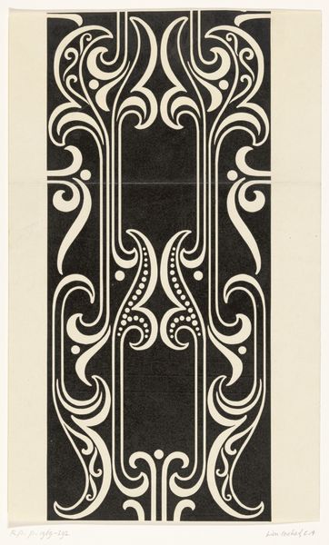
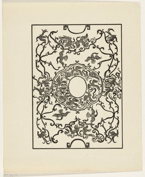
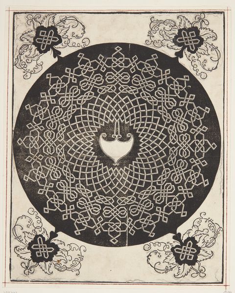
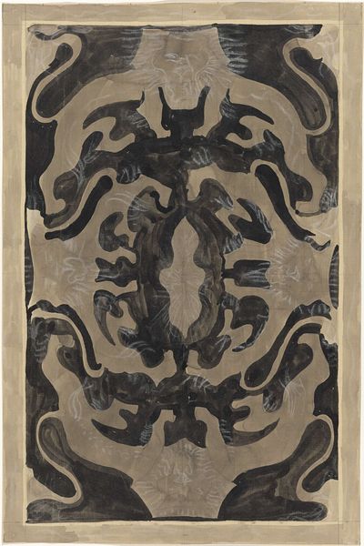
Bandontwerp voor: L'art hollandais à l'exposition internationale des arts décoratifs et industriels modernes, 1925 1925
0:00
0:00
Dimensions: height 435 mm, width 330 mm
Copyright: Rijks Museum: Open Domain
Editor: This striking woodcut, "Bandontwerp voor: L'art hollandais à l'exposition internationale des arts décoratifs et industriels modernes, 1925," was created by Carel Adolph Lion Cachet, and it’s currently held in the Rijksmuseum. The monochromatic palette and dense composition give it a very sophisticated feel. What strikes you most about it? Curator: Immediately, I notice how the visual language draws upon traditions older than the Art Deco era for which it was created, perhaps as a bridge into the future, even while referencing historical symbolism. Do you see the stylized birds, the phoenixes, and their implication of immortality and rebirth, rendered using decidedly decorative lines? Editor: Yes, I see the phoenixes now, circling the central motif! It feels so much more than mere decoration. Were phoenixes a common image in Dutch art at the time? Curator: The phoenix is less about a specifically Dutch phenomenon than a globally understood signifier, adapted here. These birds appear confined by geometric shapes, which represent modernity; they look traditional, but not. Consider their cultural weight: what does it mean to harness the promise of the phoenix amidst rapid industrialization and, only a few years later, a global economic crisis? It appears both nostalgic and forward-looking. Editor: So it’s almost as if Cachet is using these age-old symbols to suggest that even in a rapidly changing world, themes of hope and renewal endure. That tension between tradition and modernity is very potent here. Curator: Exactly! And don't forget how the symbolism plays into our own psychological need to reconcile change with continuity. What memories, hopes, or fears do you think a contemporary audience brought to the work when they saw it? Editor: I see how this visual vocabulary really deepens the message beyond a simple design. Thank you!
Comments
No comments
Be the first to comment and join the conversation on the ultimate creative platform.
More like this