drawing, paper, ink, pen
#
drawing
#
dutch-golden-age
#
paper
#
personal sketchbook
#
ink
#
pen-ink sketch
#
pen
Copyright: Rijks Museum: Open Domain
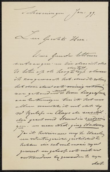
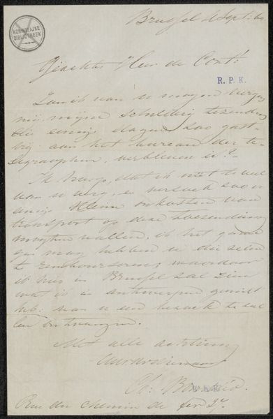
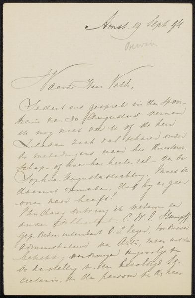
Editor: We’re looking at “Brief aan Jan Veth,” potentially from 1886, by Paul Joseph Constantin Gabriël. It’s a pen-and-ink drawing on paper, held at the Rijksmuseum. The handwriting is delicate and flowing. What stands out to you about the formal aspects of this work? Curator: The linear quality of the writing immediately draws the eye. Note how the artist carefully modulates the thickness of the pen strokes to achieve visual rhythm and balance within the confined rectangular format. Do you see how the heavier, looping downstrokes provide anchors, contrasting with the lighter, connecting lines? Editor: Yes, I see that now. The way the lines vary create a visual texture. But since it’s a letter, does the text itself contribute to the form? Curator: Precisely. The arrangement of the text blocks contributes significantly to the overall composition. Notice how the opening address, “Waarde Heer Veth,” acts as a central focal point, from which the other written passages are then spatially oriented. This conscious construction guides the viewer's eye through the visual field. Are you picking up on how the careful use of whitespace further enhances readability and aesthetic appeal? Editor: It's interesting how you're making a case for the artistry even within a seemingly functional document. I hadn't considered that. Thank you. Curator: Indeed. By appreciating these formal elements, we move beyond mere interpretation of the text's content, and towards appreciating the artist’s skill in deploying line, space, and texture to craft an elegant visual experience.
Comments
No comments
Be the first to comment and join the conversation on the ultimate creative platform.
More like this