drawing, paper, ink
#
portrait
#
drawing
#
paper
#
ink
#
calligraphy
Copyright: Rijks Museum: Open Domain
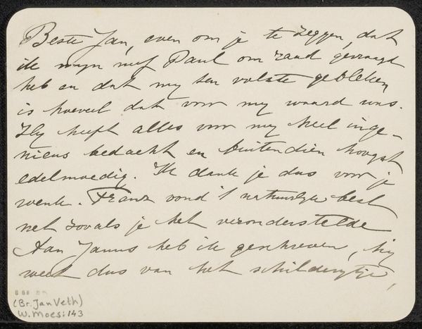
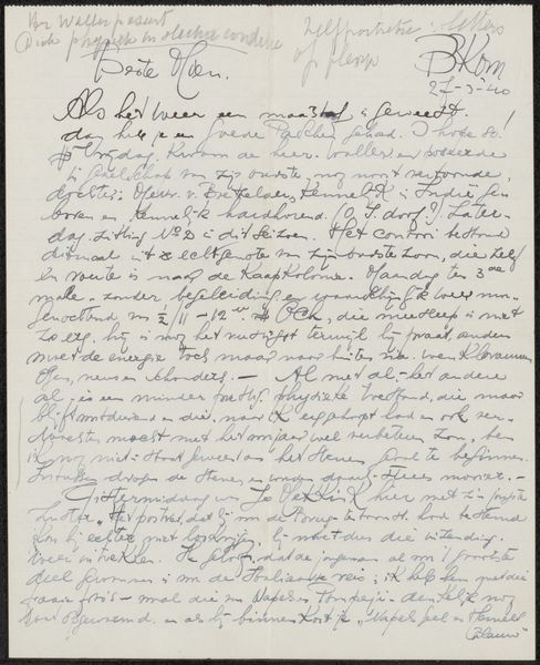
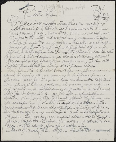
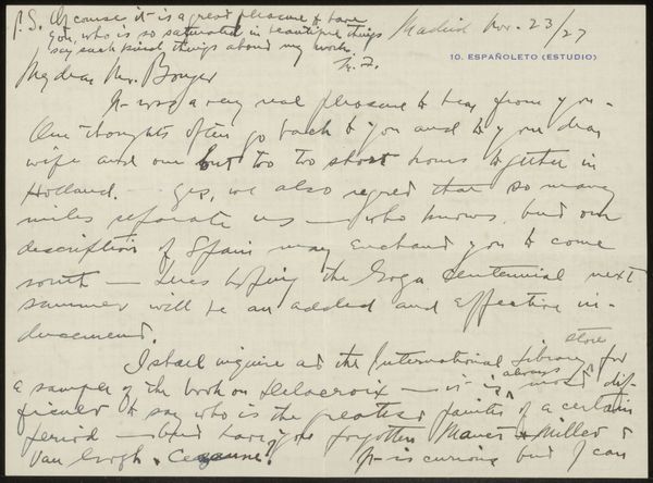
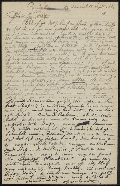
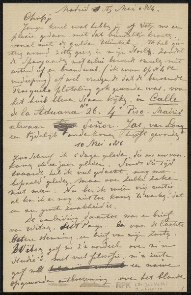
This is a letter to Philip Zilcken by W.J.G. van Meurs, probably written with a dip pen and ink, sometime around 1907. The thing that grabs me right away is the evenness and rhythm of the writing, a bit like a field of marks. You can really see the movement of the hand, the pressure and release of the pen creating these lovely, looping forms. Each stroke feels considered, yet there's also a looseness, an ease, as the hand moves across the page. The dark ink on the aged paper is a classic contrast. It’s kind of like a drawing. I’m drawn to the way the words cluster together, forming these dense, almost abstract shapes. It makes me think about how we read – not just for the content, but also for the visual experience. Like a painting, the letter invites you to look, to linger, to appreciate the texture and the flow. It reminds me of Cy Twombly’s scrawling text paintings, but it also reflects the way artists use everyday objects and techniques, transforming them into something beautiful and meaningful. So much can be done with humble materials and an openness to the act of creation.
Comments
No comments
Be the first to comment and join the conversation on the ultimate creative platform.
More like this