graphic-art, typography
#
graphic-art
#
art-nouveau
#
typography
#
decorative-art
Dimensions: height 207 mm, width 316 mm
Copyright: Rijks Museum: Open Domain
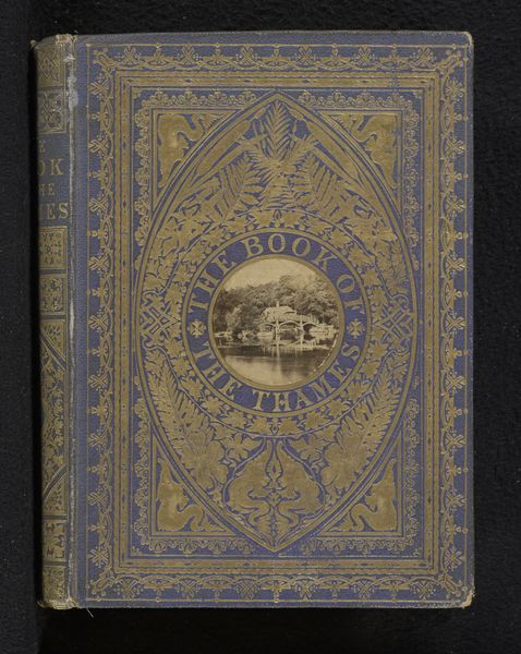
This book cover for Herman Robbers’ “Van stilte en stemming” was made in 1905 by an anonymous designer, most likely using ink and dyes on linen. The blue fabric gives the cover a kind of calm, still feeling. I’m really drawn to how the gold ink sits on the textured surface. It is a simple colour combination, but it's got depth. Look at how the ink catches the light differently depending on the weave. You can almost feel the fabric under your fingers. The stylized floral pattern and lettering feels both precise and a little wonky, like it was done by hand with care, but not striving for perfection. The mirroring of the image creates balance but also a sense of movement. It reminds me of the work of Gustav Klimt, with its emphasis on surface decoration and stylized forms. But here, the anonymous designer embraces the imperfections of the handmade, creating a unique and intimate object. Art is always a conversation, across time and between artists. And sometimes, the most beautiful conversations happen in whispers.
Comments
No comments
Be the first to comment and join the conversation on the ultimate creative platform.
More like this