Curatorial notes
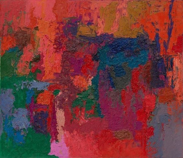
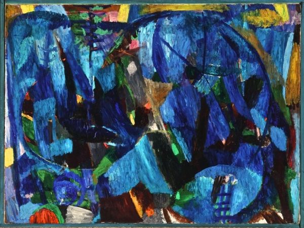
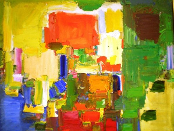
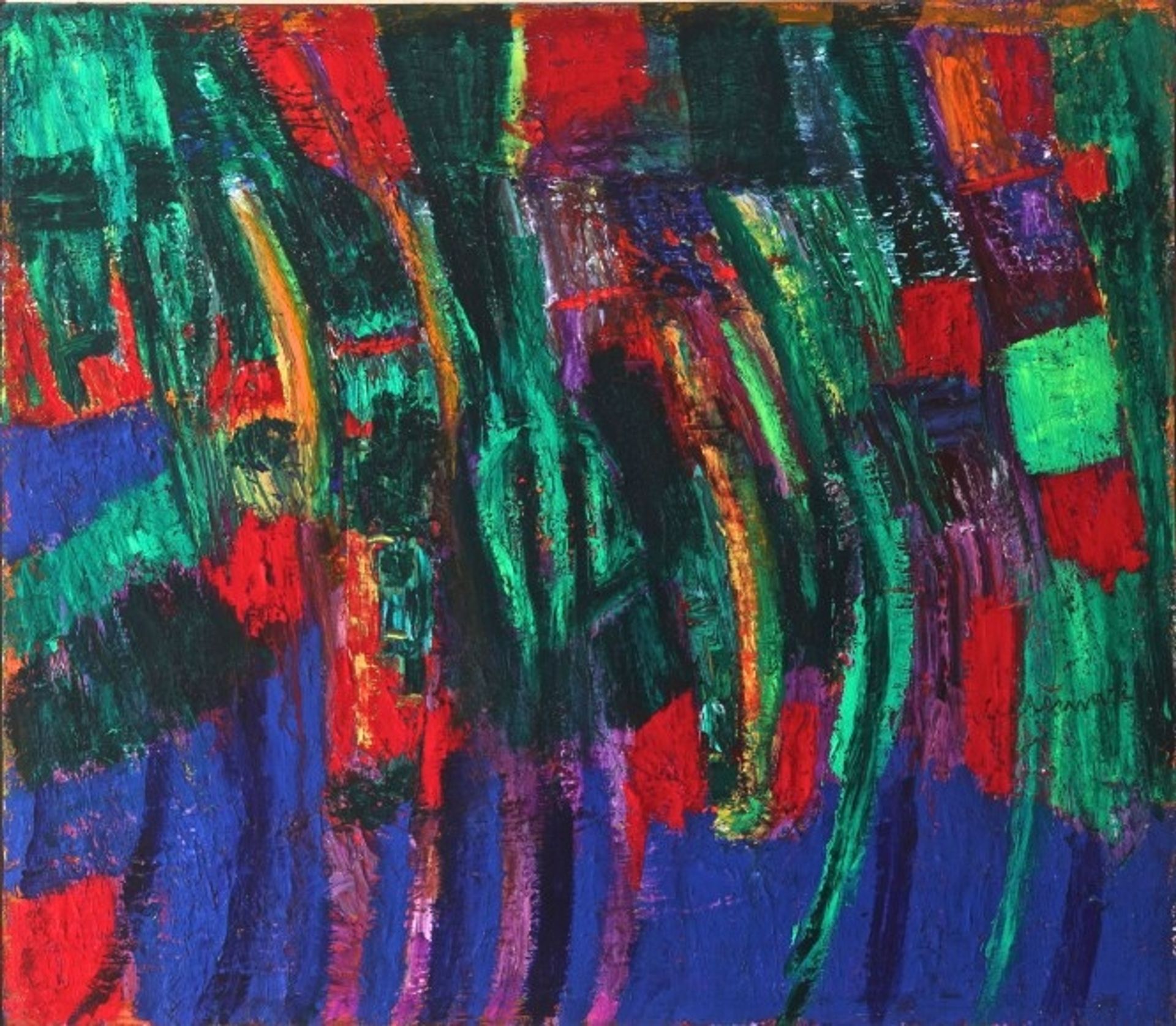
Bruno Cassinari made this painting, Riflessi Marini, with what looks like oil on canvas, and I love how he’s built up the surface. The strokes of color are really direct, not blended so much as placed, one next to the other, like mosaic tiles. There’s a real physical presence to the paint itself. Look at the blues at the bottom – that textured surface, almost like corrugated iron, gives the sense of the heavy depths of the sea, and then at the top, the reds feel like a sunset, but also like the land, because of their earthiness. There is this really lovely passage, a kind of flickering green cascade. It reminds me of Joan Mitchell, the way she used these intense color combinations to evoke a sensation of being in nature. But with Cassinari, there’s something more solid, more grounded, less purely atmospheric. It feels like a conversation between abstraction and representation, where neither quite wins, but both get to have their say.