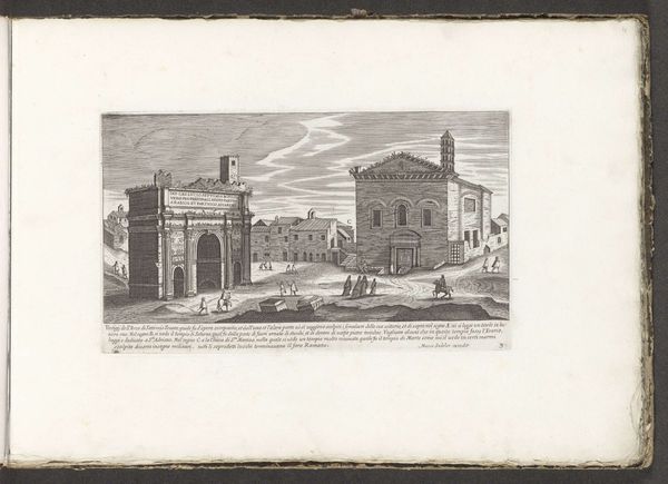
About this artwork
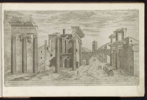
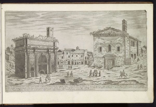
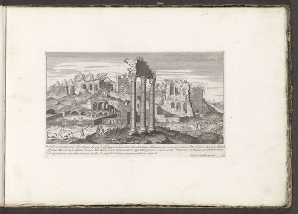
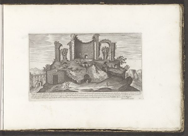
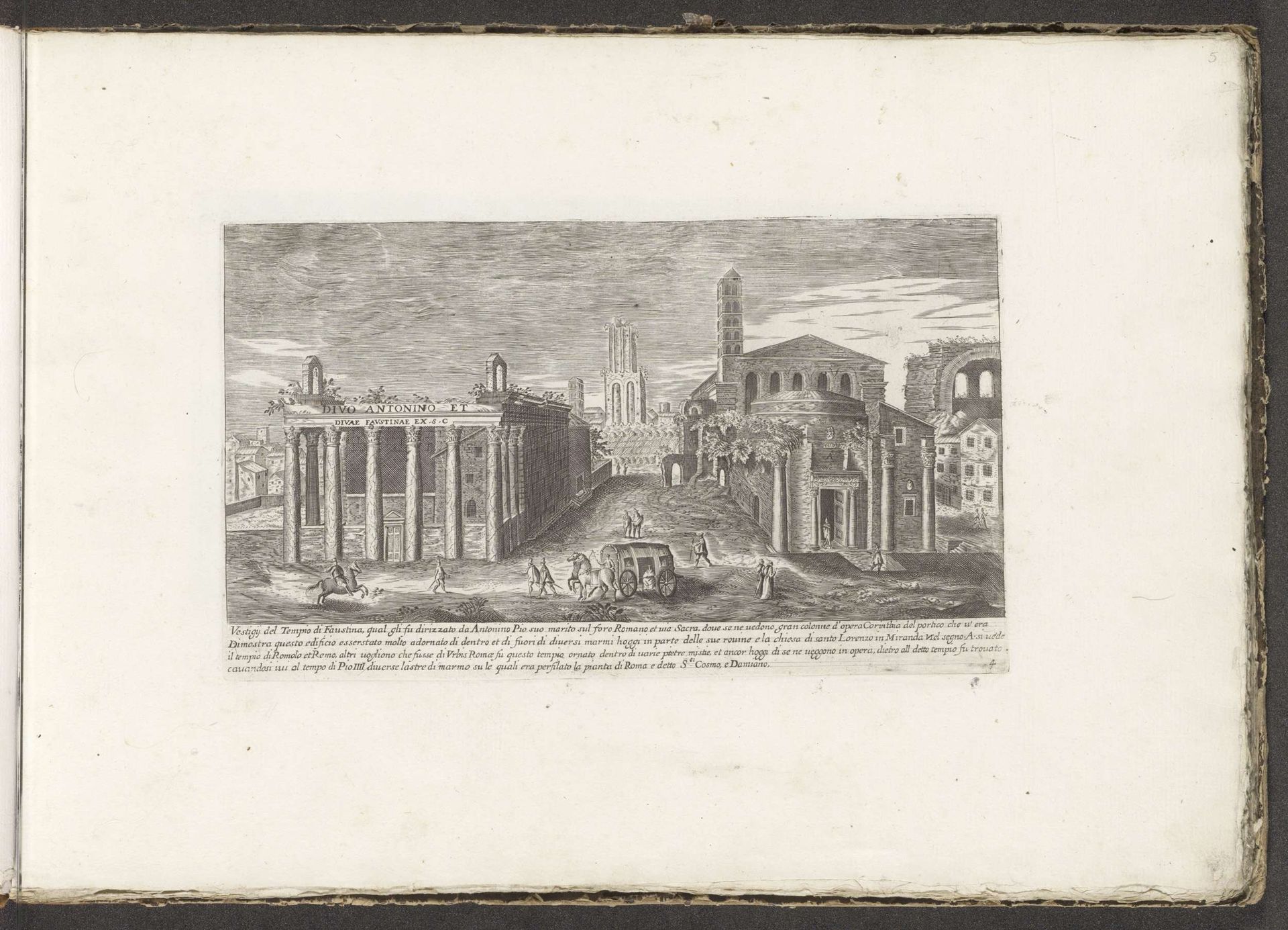
Curator: Let’s turn our attention to this intriguing 17th-century cityscape. Attributed to an anonymous artist and created around 1680, it presents an engraved view of Rome featuring the Temple of Antoninus Pius and Faustina alongside the Temple of Romulus. Editor: My initial impression is one of striking balance. The composition feels meticulously ordered, almost mathematical, with the temples presented in parallel alignment against the receding cityscape. There’s a clear visual hierarchy established. Curator: Precisely. Considering the Baroque period’s socio-political climate, these classical structures stand as potent symbols. These weren’t simply depictions of old buildings, but assertions of power, continuity, and legitimacy constructed to support dominant patriarchal structures. The revival of classical forms was meant to solidify links between past and present, to emphasize a kind of inherited authority. Editor: Indeed. But focusing on the formal elements, observe how the artist employs the precise, linear quality of engraving. It serves not only to accurately represent architectural details but also to imbue the scene with a sense of austere grandeur. Light and shadow play strategically across the surfaces, accentuating the geometry of each form and conferring depth. Curator: I think this approach deliberately minimizes the everyday realities. We need to remember that while we’re presented with an idealized vision of Rome’s architecture, it neglects the complex social and economic struggles happening in this period. Was the glorification of the past and its association with divinity a conscious act that intentionally eclipsed present problems? Editor: A valid perspective. But doesn’t the technical prowess speak to a reverence for rational order and human achievement, values prized by classicists even today? Look at the receding planes. The composition emphasizes perspective; each form carefully diminishes with distance. It constructs an idealized visual space as a system of representation that makes this reading plausible. Curator: True, the masterful technical rendering is important to acknowledge, yet what of the narrative constructed? Rome is presented as an open book for the cultured traveler; and that privilege, that opportunity, was clearly restricted to an elite. Editor: An astute observation. While the anonymous authorship hinders direct biographical interpretation, it’s this careful arrangement of lines, shapes, and spaces that evokes a sense of monumental permanence. Curator: On balance, reflecting on this image gives a window into art's potential to simultaneously reveal and conceal its societal influences. Editor: And to see its timelessness. An impressive fusion of historical documentation and symbolic formalism, regardless of artist attribution.
Artwork details
- Medium
- drawing, print, ink, engraving, architecture
- Dimensions
- height 157 mm, width 269 mm
- Copyright
- Rijks Museum: Open Domain
Tags
Comments
Share your thoughts
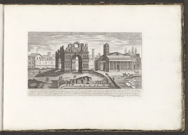
About this artwork
Curator: Let’s turn our attention to this intriguing 17th-century cityscape. Attributed to an anonymous artist and created around 1680, it presents an engraved view of Rome featuring the Temple of Antoninus Pius and Faustina alongside the Temple of Romulus. Editor: My initial impression is one of striking balance. The composition feels meticulously ordered, almost mathematical, with the temples presented in parallel alignment against the receding cityscape. There’s a clear visual hierarchy established. Curator: Precisely. Considering the Baroque period’s socio-political climate, these classical structures stand as potent symbols. These weren’t simply depictions of old buildings, but assertions of power, continuity, and legitimacy constructed to support dominant patriarchal structures. The revival of classical forms was meant to solidify links between past and present, to emphasize a kind of inherited authority. Editor: Indeed. But focusing on the formal elements, observe how the artist employs the precise, linear quality of engraving. It serves not only to accurately represent architectural details but also to imbue the scene with a sense of austere grandeur. Light and shadow play strategically across the surfaces, accentuating the geometry of each form and conferring depth. Curator: I think this approach deliberately minimizes the everyday realities. We need to remember that while we’re presented with an idealized vision of Rome’s architecture, it neglects the complex social and economic struggles happening in this period. Was the glorification of the past and its association with divinity a conscious act that intentionally eclipsed present problems? Editor: A valid perspective. But doesn’t the technical prowess speak to a reverence for rational order and human achievement, values prized by classicists even today? Look at the receding planes. The composition emphasizes perspective; each form carefully diminishes with distance. It constructs an idealized visual space as a system of representation that makes this reading plausible. Curator: True, the masterful technical rendering is important to acknowledge, yet what of the narrative constructed? Rome is presented as an open book for the cultured traveler; and that privilege, that opportunity, was clearly restricted to an elite. Editor: An astute observation. While the anonymous authorship hinders direct biographical interpretation, it’s this careful arrangement of lines, shapes, and spaces that evokes a sense of monumental permanence. Curator: On balance, reflecting on this image gives a window into art's potential to simultaneously reveal and conceal its societal influences. Editor: And to see its timelessness. An impressive fusion of historical documentation and symbolic formalism, regardless of artist attribution.
Comments
Share your thoughts