Copyright: Public domain
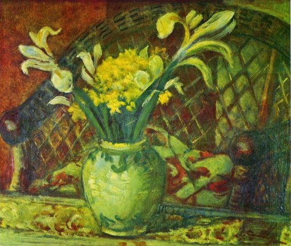
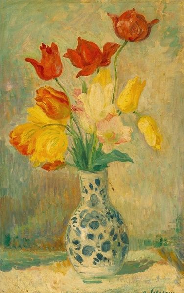
Curator: Here we have Alfred William Finch’s "Two Vases with Tulips," an oil painting dating from 1915. What are your initial impressions? Editor: A charming scene, almost cloyingly so. There’s something about the overly-sweet palette of pinks and oranges set against that sickly green vase. Curator: Yes, the color relationship is intriguing. Note how Finch plays with complementary hues – the almost electric green of the smaller vase set against the vibrant oranges and reds of the tulips and backdrop. The texture, too, is noteworthy – thick impasto, especially evident in the petals. It gives the whole work a vibrant, almost tactile quality. Editor: Absolutely, and tulips themselves carry quite a bit of symbolism, depending on the era and cultural context. Red tulips often speak of perfect love, while the purple ones hint at royalty. Though the emotional register in Finch's rendering strikes me as less intense – domestic, cozy, a little too picture-perfect, perhaps. Is he intentionally muting some of the tulips' loaded symbolism? Curator: I think it’s a compelling idea. By muting these traditional associations, Finch focuses the viewers’ attention to a much simpler semiotic equation: a pleasing juxtaposition of shape, line, and hue rendered with a particular paint application that directs attention back to itself. Observe how the curves of the tulip petals echo the curves of the vases, setting up a constant repetition throughout the work’s components. Editor: So, he empties them of deeper resonance. Perhaps the overall arrangement suggests a type of artifice. Tulips, popular then, could have also signaled fleeting beauty or vanity – emblems of prosperity and transience during the infamous "Tulip Mania" era. Do we know if he was referencing that time? Curator: There is little known about any intentions to directly address “Tulip Mania”. We can note how Finch plays with depth of field. Observe how shallow the composition is, flattening the pictorial space. This emphasis creates a concentrated field of observation which in turn highlights the careful rendering of color. Editor: That tightness certainly builds a kind of…visual pressure. The bright colors, too, almost vibrate against each other. It's both engaging and a little unsettling. Curator: Well, it seems we have each found points of interest and perhaps mild disagreement. Editor: Exactly! It seems both the structure and symbolic aura combine to offer quite a lively viewing.
Comments
No comments
Be the first to comment and join the conversation on the ultimate creative platform.