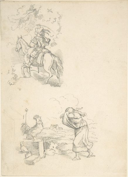
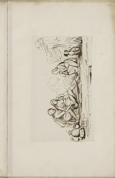
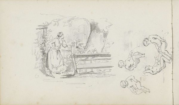
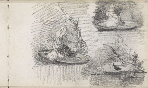
T.v.: To udkast til pen og blækhus. T.h. Siddende mand, der læner sig ind over bordet 1866
0:00
0:00
drawing, ink, pencil, pen
#
portrait
#
drawing
#
pencil sketch
#
ink
#
ink drawing experimentation
#
pen-ink sketch
#
pencil
#
pen
Dimensions: 135 mm (height) x 208 mm (width) (bladmaal)
Curator: Let’s have a closer look at this sheet of studies, made in 1866 by Lorenz Frølich. The full title is "T.v.: To udkast til pen og blækhus. T.h. Siddende mand, der læner sig ind over bordet," and it's comprised of pencil, pen, and ink drawings. It's a fascinating glimpse into the artist’s process. Editor: The overall feel is intimate, almost melancholy. The sketches of the inkwells on the left are rendered with sharp, decisive lines, contrasting with the hazy depiction of the man on the right. The contrast in tone makes for an intriguing visual tension. Curator: Absolutely, and that tension probably tells us a lot about the artist's creative activity. He focuses keenly on the means of production –the quills, inkwells, the implements of writing—almost fetishizing their texture and form, then we see the intellectual activity those instruments enable, represented by the sketch of the man slumped over his table. I imagine he is deeply invested in the manual labor of art making, here, the physical act of writing. Editor: I'm struck by how Frølich uses line to create such distinct moods. The inkwells are built up with dense cross-hatching, giving them a real weight and presence. This sharper, more defined treatment seems almost like an assertion of objective, observable form, while the man is lighter, ephemeral, as if disappearing into the background. I suppose we can observe how the act of thinking and the activity of writing may have occupied different realms for the artist himself. Curator: Indeed. Notice too, how he experiments with different pens and inks to achieve varying effects. It isn’t just the image, it's about the materials he’s choosing. The two detailed studies show two possible arrangements for inkwells on a writing desk—both likely commonplace bourgeois objects that nonetheless he gives incredible attention. Editor: The contrast between these scenes really defines the composition for me, one grounded in intense materiality, and one where that very same set of objects—a pen, a desk, an inkwell—is then employed in the evocation of something incorporeal, pensive, a melancholic contemplation of the intellectual labor behind literary creativity. Curator: And by looking closely, we gain a richer appreciation for the social circumstances behind art. Editor: This certainly compels me to want to scrutinize Frohlich’s formal treatment of similar themes in his later, more fully realized works.
Comments
No comments
Be the first to comment and join the conversation on the ultimate creative platform.
More like this