Copyright: CC0 1.0
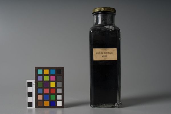
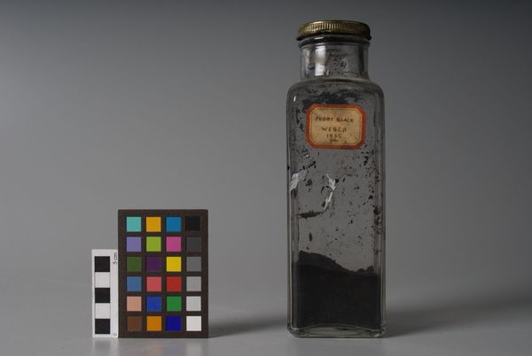
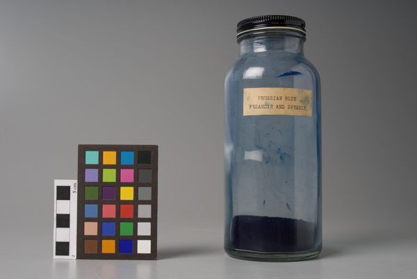
Editor: This is "Noir Ivoire? extra," made by Le Franc. It's an interesting juxtaposition of the stark black pigment against the clear glass. What strikes you about the composition? Curator: The object presents a study in contrasts. The chromatic intensity of the pigment is set against the transparency of the glass. Note the textured label, a small rectangle affixed asymmetrically, which introduces a further planar element. Editor: So, the label adds to the geometry of the artwork? Curator: Precisely. It disrupts the expected cylindrical form and invites closer inspection of surface and inscription. One might consider the relationship between container and contained. Editor: I never thought of it that way. Thank you.
Comments
No comments
Be the first to comment and join the conversation on the ultimate creative platform.
More like this