#
amateur sketch
#
toned paper
#
light pencil work
#
pencil sketch
#
personal sketchbook
#
ink drawing experimentation
#
pen-ink sketch
#
sketchbook drawing
#
pencil work
#
sketchbook art
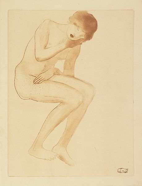
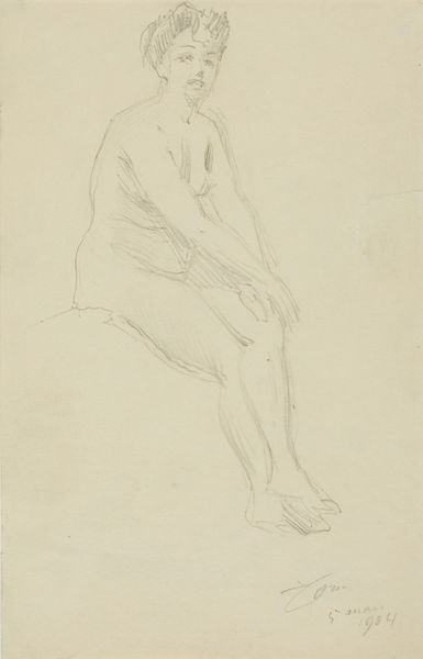
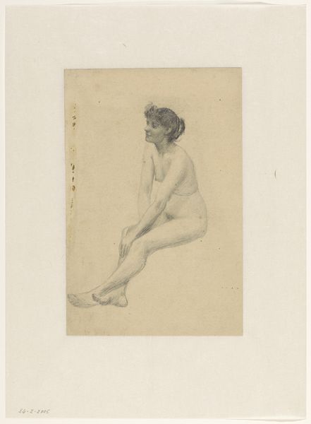
Dimensions: height 284 mm, width 202 mm
Copyright: Rijks Museum: Open Domain
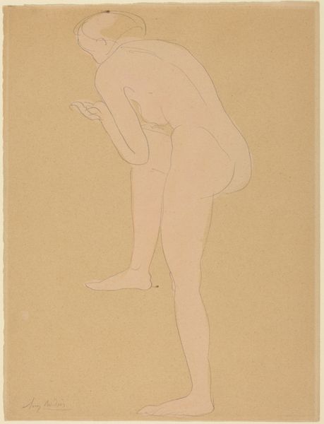
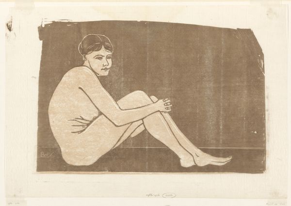
Curator: Jan Mankes' "Vrouwelijk naakt," created between 1913 and 1916. It's rendered in pencil on paper. Editor: It's so simple, almost ethereal. I’m struck by the soft, hazy quality. It feels like catching a glimpse of something intensely private. Curator: The beauty of this work resides in its elemental composition, a study of line and form. The figure’s pose, seated with a downward gaze, creates a contained, introspective space. Notice how the subtle variations in pressure articulate the volumes. Editor: Introspective is right. There's this quiet melancholy about her stance. She's turning inward, shutting out the world. And that pale pencil just adds to that feeling of… vulnerability? It’s beautifully haunting. Curator: Mankes uses the lack of precise detail strategically. This enhances the universality of the figure, allowing the viewer to project their own emotional landscape onto her. The economy of line serves to emphasize the contours of the body. Editor: The fact that it feels unfinished—a quick study perhaps—actually enhances the emotion. You can sense the artist’s hand, the immediacy of the moment. She looks… burdened. Curator: Her burden, real or imagined, becomes a subject of our speculation. This reflects the modernist preoccupation with psychological states. We are compelled to decode Mankes' visual vocabulary, searching for meaning within its simplified structure. Editor: It reminds me of a faded memory, something precious and delicate threatened with disintegration. It is very raw and unpolished, but its core is moving. Curator: Mankes offers an exquisite rendering of the human form through precise control of light and shadow. Its evocative nature demonstrates the power of artistic reduction. Editor: Absolutely, in art, you need to remove rather than add, so people can read through to the heart. Thanks for helping me look closer.
Comments
No comments
Be the first to comment and join the conversation on the ultimate creative platform.
More like this