Dimensions: image: 10 x 5.6 cm (3 15/16 x 2 3/16 in.) sheet: 19.9 x 13.9 cm (7 13/16 x 5 1/2 in.)
Copyright: National Gallery of Art: CC0 1.0
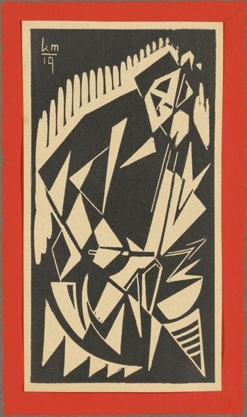
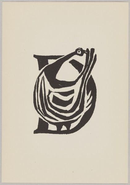
Curator: Here we have Cor de Wolff’s “Letter W,” likely from 1953, executed as a linocut print. Its monochrome abstraction immediately strikes a compelling mood. Editor: Striking is right! There's a potent feeling of both boldness and constraint—a stark duality emphasized by the black and white contrast. What immediately stands out to me is the almost totemic quality. The letter "W" seems to be anthropomorphized, or perhaps acting as a vessel for multiple implied figures. Curator: Indeed. The structural rigor of the Art Deco influence is evident here, note the deliberate use of geometric forms. Observe how the artist meticulously balances positive and negative space. Each shape, each line, exists in a calculated relationship to the others, generating visual harmony. The “W” acts as the literal, and compositional, backbone. Editor: But let’s delve deeper than formal arrangement. Look at what that backbone supports: suggestive profiles nestled within the letterforms, almost as if emerging from or trapped within the symbolic 'W'. Given this was made, plausibly, shortly after the Second World War, does that W stand for "War"? Does the compressed composition reflect societal anxieties about what lies ahead in 1953? The stylized visage near the top is giving off a gas-mask feeling as well... Curator: It’s compelling how you weave history into the visual analysis. Semiotically speaking, we have the recurring motif of duality. Two profiles, light and dark halves within each “W” section. A very structured rendering and considered use of mirroring, to evoke harmony. De Wolff invites us to consider the nature of symbolic representation itself, and how the material nature of the linocut impacts the crisp visual language of print. Editor: But it doesn't feel cold, despite its meticulousness. I'm drawn to the phrase at the base: "De eerste van 't jaar…Dank U." "The first of the year...Thank you." An offering? Gratitude in the face of what the "W" might represent: worry, woe, weariness? It adds a layer of human emotion often missing in pure formalism. Curator: Your perspective highlights the potency of iconographic readings. Considering those embedded meanings and connecting them with de Wolff’s stylistic mastery brings the artwork into even sharper focus. Editor: It becomes so much more than mere aesthetics—a visual encapsulation of a specific moment, pregnant with symbolic tension. Curator: A fascinating fusion of form and feeling. Editor: A potent message indeed.
Comments
No comments
Be the first to comment and join the conversation on the ultimate creative platform.