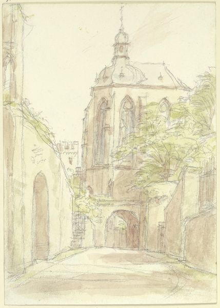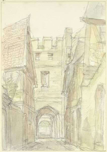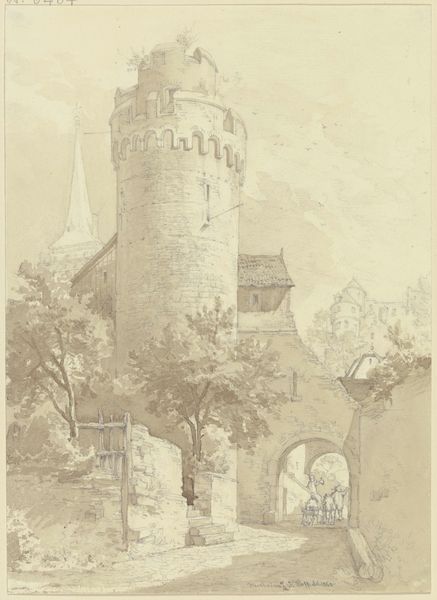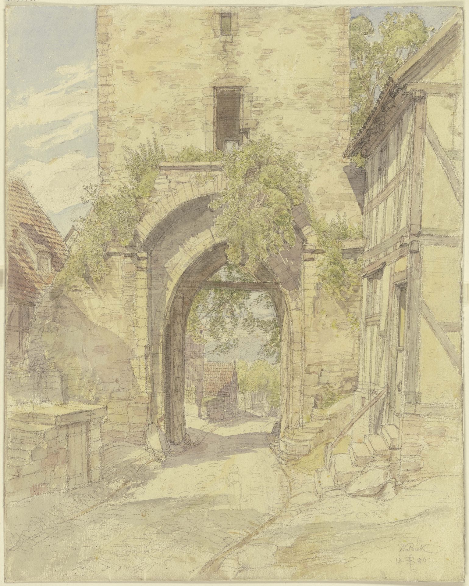
1880
Torweg in Waldeck mit Ausblick auf eine bergabführende Straße
Listen to curator's interpretation
Curatorial notes
Editor: Here we have Peter Becker's 1880 watercolor and pencil drawing, "Torweg in Waldeck mit Ausblick auf eine bergabführende Straße," or "Gateway in Waldeck with a view of a road leading downhill." It's currently housed at the Städel Museum. I find it quite serene; the muted colors create a dreamlike quality. What stands out to you? Curator: The careful articulation of line and form are quite striking. Consider how the artist employs hatching and cross-hatching to define the architectural mass of the gate tower. The interplay between light and shadow shapes the spatial dimensions. Editor: Yes, the depth he achieves with such delicate lines is remarkable! It’s almost as if he’s more interested in the texture of the stone than accurately portraying the landscape. Do you think the loose application of the watercolor contributes to this? Curator: Precisely. Note the way Becker contrasts the sharp, linear definition of the stonework with the softer, more diffuse application of watercolor washes to represent foliage. This juxtaposition calls our attention to the artifice of representation itself, foregrounding the materiality of the medium. Consider the composition; how does the artist’s placement of the gate, slightly off-center, affect our perception of space and depth? Editor: It pushes my eye further down the road. Without that asymmetry, the drawing might feel flat, or too formal. It’s strange to consider that asymmetry is vital to establishing depth in an image. Curator: Exactly. This imbalance lends a certain dynamism to the composition, guiding the viewer's gaze into the landscape. A useful reminder of how even seemingly simple aesthetic choices contribute to the overall meaning and impact of an artwork. Editor: I never thought about a landscape in terms of its "meaning" like that before. Thanks for making that clear!