tempera, painting
#
portrait
#
medieval
#
tempera
#
painting
#
figuration
#
oil painting
#
history-painting
#
italian-renaissance
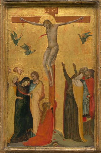
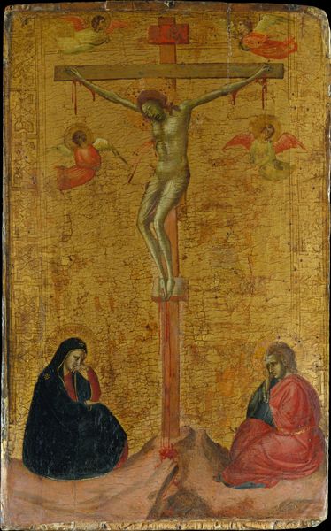
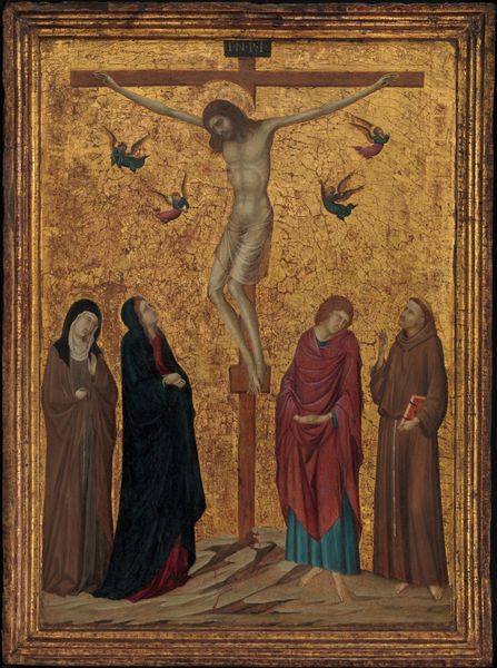
Dimensions: height 51 cm, width 30.5 cm
Copyright: Rijks Museum: Open Domain
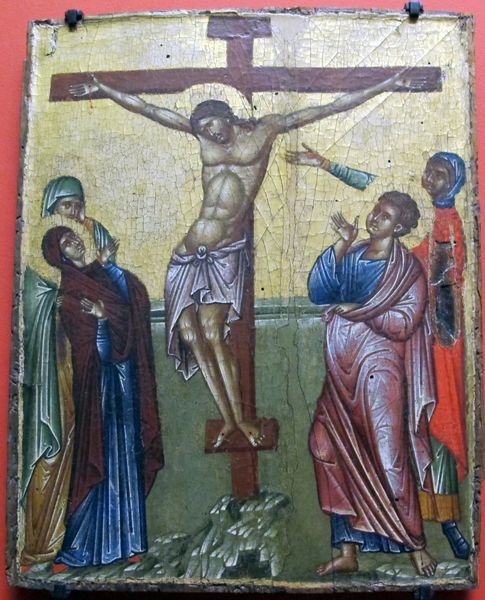
Editor: This is Giovanni da Milano's "The Crucifixion," a tempera painting from around 1360. The gold leaf background and the flat, almost graphic figures create such a striking, otherworldly effect. What stands out to you about this work? Curator: Let's consider the material context. Tempera itself, a binder of egg yolk, demands a particular method – building up thin layers of pigment. This painstaking process speaks to the role of artistic labor in crafting religious meaning, right? Not divinely inspired, but skillfully made. Editor: Absolutely, it emphasizes the physicality of creation. And the gold leaf? It practically screams wealth and status! Curator: Precisely! Think about where this painting might have been displayed. Not a peasant's hut, that's for sure. The materials indicate a wealthy patron, someone with the means to commission such an elaborate piece. Now, look closely at the pigments. What do their sources and availability suggest to you? Editor: Hmmm… the blues seem vibrant, perhaps lapis lazuli, which I know was super expensive. It reinforces the idea of luxury, doesn't it? Curator: Exactly! And the red pigments, think about where those materials would have been sourced geographically and how the trade affected the artwork itself? The whole visual effect is predicated on accessing specific material chains. Do you notice how the angels catching Christ's blood are the same shades of red and blue? Editor: Yes, it’s definitely creating a direct visual connection. I never thought about trade having an influence on the colors of artwork! That’s quite eye-opening. Curator: It challenges the idea of a solely "spiritual" interpretation. Material constraints and economic realities were always present. How different is our access to colors today because of cheaper, easier production and consumption models? Editor: I'll never look at a medieval painting the same way! Thank you.
Comments
rijksmuseum over 2 years ago
⋮
Giovanni da Milano introduced richer colour and a more refined style to Florentine painting of the late 14th century. This is seen in the graceful silhouettes of the figures against the traditional gold ground. The panel was probably painted for someone with a special connection to the saints depicted: Francis, Mary Magdalene, the Virgin Mary, John the Evangelist and Ignatius of Antioch.
Join the conversation
Join millions of artists and users on Artera today and experience the ultimate creative platform.
More like this