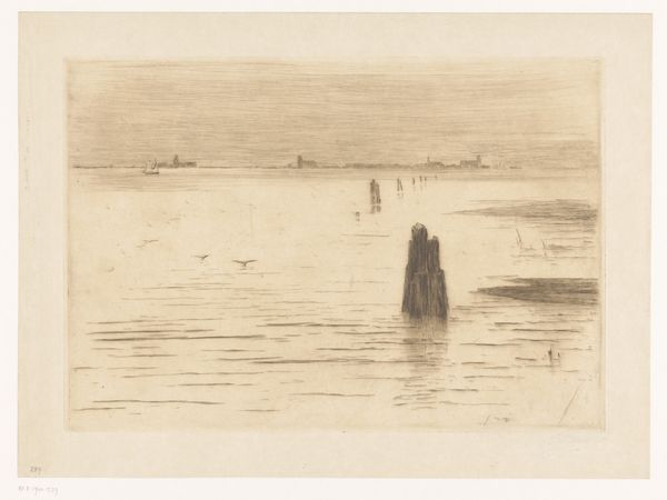
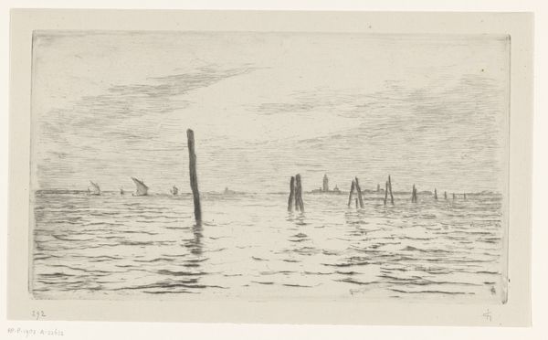
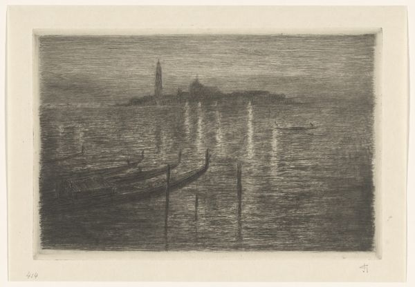
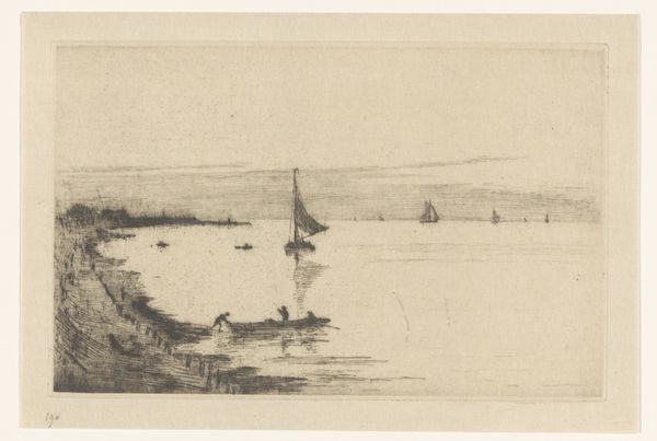
Lagune van Venetië met drie zeilschepen 1851 - 1924
0:00
0:00
carelnicolaasstormvansgravesande
Rijksmuseum
drawing, pencil
#
drawing
#
amateur sketch
#
light pencil work
#
shading to add clarity
#
impressionism
#
pencil sketch
#
incomplete sketchy
#
landscape
#
personal sketchbook
#
ink drawing experimentation
#
pen-ink sketch
#
pencil
#
sketchbook drawing
#
cityscape
#
pencil work
#
realism
Dimensions: height 252 mm, width 324 mm
Copyright: Rijks Museum: Open Domain
Curator: Welcome. Before us is a pencil drawing by Carel Nicolaas Storm van 's-Gravesande titled "Lagune van Venetië met drie zeilschepen," or "Venetian Lagoon with Three Sailing Ships." It was made sometime between 1851 and 1924, and is held at the Rijksmuseum. Editor: It's evocative. The immediate impression is one of quiet observation. A kind of still, hushed atmosphere. The delicate pencil strokes create soft reflections on the water...the limited tonal range amplifies the calm mood. Curator: Indeed. Storm van 's-Gravesande was deeply influenced by the Hague School, which championed realistic depictions of Dutch life and landscapes, although here we see his rendering of Venice. It’s tempting to see Venice here as more of a generic port city with international importance than some kind of uniquely romantic symbol as some paintings of the time did. Editor: Notice how the texture is built up through layers of hatching and cross-hatching. It’s especially evident in the way the light shimmers on the water's surface. Those tonal modulations are quite effective. They really suggest movement and depth despite the monochromatic palette. Curator: The work has been tagged as an “amateur sketch,” perhaps alluding to the Hague School embracing depictions of the ordinary. Still, it appears on high-quality paper, and he’s taken great pains to make a legible image. Perhaps his aim here was capturing an essence more so than documentation? What would the implications be of this artwork entering into a gallery setting? Editor: Legibility is key to its aesthetic success! By simplifying the scene, by concentrating on capturing only the essence of each element, he makes the whole thing stand out far greater than it should. You can appreciate his mark making when understanding the reflections and form of ships. The clarity adds to the overall harmony of the composition, but there’s tension too, a subtle play between order and spontaneity. Curator: Perhaps this tension, this embracing of imperfection is part of what made his works increasingly sought-after and displayed, further blurring the lines between the traditional idea of the pristine masterpiece and the quick impression. This piece certainly reflects shifting artistic and cultural values towards an appreciation of everyday scenes. Editor: Agreed. Looking again, the artist invites us into a meditative experience, and that perhaps speaks to a different kind of cultural value that prioritizes capturing atmosphere in fleeting moments of natural observation. Curator: Precisely. It offers insight into how perceptions of cityscapes evolved during a time of immense social change. Editor: I appreciate your points and it also shows the beauty one can find in reduction.
Comments
No comments
Be the first to comment and join the conversation on the ultimate creative platform.
More like this