About this artwork
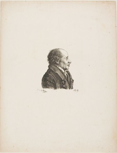
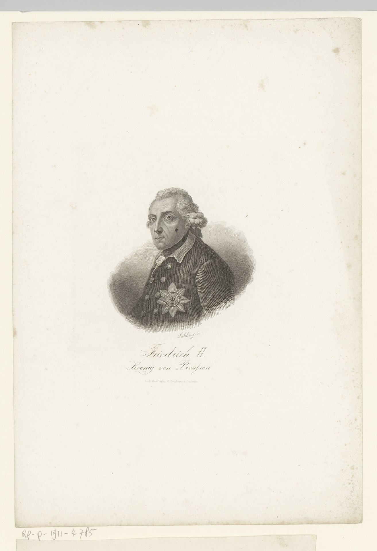
Editor: Here we have Lazarus Gottlieb Sichling's "Portrait of Frederick the Great," an engraving somewhere between 1822 and 1863. The precision of the lines is striking, almost photographic, yet the limited tonal range gives it an austere feel. What compositional choices stand out to you? Curator: The immediate element that draws the eye is the figure's placement. Sichling consciously employed a centered composition. The tight framing further concentrates visual information, isolating the figure from any contextual background, compelling us to scrutinize form and line. Note the artist's decision to vignette the figure; it avoids the hard edges of the substrate. This creates a visual paradox - the softness of the vignette contrasts the rigid detail of the engraving. The light areas create depth, while darkness outlines contours of his figure. Editor: I hadn't thought of that contrast, between the softness and sharpness, before. It’s all about the internal elements then? The arrangement, lines and contrast of texture? Curator: Precisely. We consider the internal structure and organization that generates aesthetic experience. Every component plays a crucial part within the visual experience. The tension created between line, tone, and framing, shapes our understanding and generates the impact of this image. What did you initially observe? Editor: Initially I missed some nuances in this "Portret van Frederik de Grote", I realize now that seeing through form, light, line, is central. Thanks for the pointers! Curator: Indeed. Art offers inexhaustible interpretations; and looking closely gives endless rewards.
Artwork details
- Medium
- print, engraving
- Dimensions
- height 295 mm, width 205 mm
- Copyright
- Rijks Museum: Open Domain
Tags
portrait
neoclacissism
old engraving style
engraving
realism
historical font
Comments
No comments
About this artwork
Editor: Here we have Lazarus Gottlieb Sichling's "Portrait of Frederick the Great," an engraving somewhere between 1822 and 1863. The precision of the lines is striking, almost photographic, yet the limited tonal range gives it an austere feel. What compositional choices stand out to you? Curator: The immediate element that draws the eye is the figure's placement. Sichling consciously employed a centered composition. The tight framing further concentrates visual information, isolating the figure from any contextual background, compelling us to scrutinize form and line. Note the artist's decision to vignette the figure; it avoids the hard edges of the substrate. This creates a visual paradox - the softness of the vignette contrasts the rigid detail of the engraving. The light areas create depth, while darkness outlines contours of his figure. Editor: I hadn't thought of that contrast, between the softness and sharpness, before. It’s all about the internal elements then? The arrangement, lines and contrast of texture? Curator: Precisely. We consider the internal structure and organization that generates aesthetic experience. Every component plays a crucial part within the visual experience. The tension created between line, tone, and framing, shapes our understanding and generates the impact of this image. What did you initially observe? Editor: Initially I missed some nuances in this "Portret van Frederik de Grote", I realize now that seeing through form, light, line, is central. Thanks for the pointers! Curator: Indeed. Art offers inexhaustible interpretations; and looking closely gives endless rewards.
Comments
No comments