drawing, pencil
#
portrait
#
pencil drawn
#
drawing
#
baroque
#
pencil sketch
#
pencil drawing
#
pencil
#
italian-renaissance
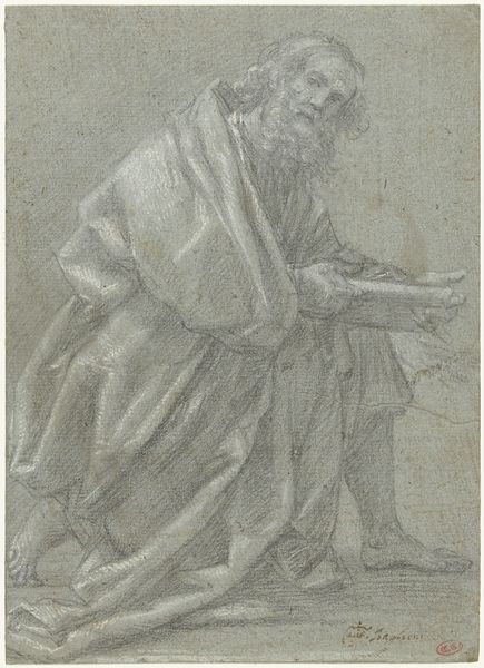
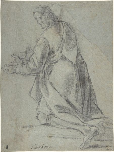
Dimensions: height 258 mm, width 205 mm
Copyright: Rijks Museum: Open Domain
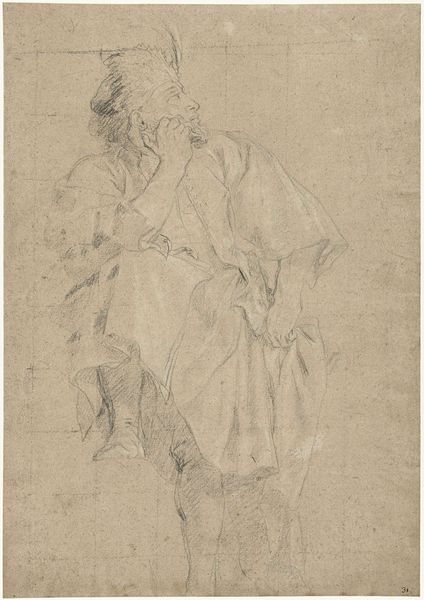
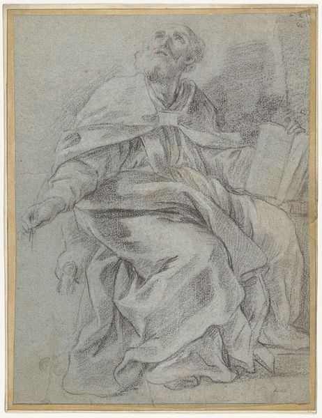
Editor: Here we have Lieven Mehus's "Study for a Kneeling Figure," a pencil drawing dating sometime between 1640 and 1691. It’s interesting to see the artist's hand so clearly in the marks, especially with the drapery. How do you interpret the interplay between the loose lines and more defined forms in this study? Curator: Indeed. One sees how Mehus utilizes line weight and density to construct form. Observe the sharp, decisive strokes delineating the contours of the figure’s robe in contrast to the fainter, almost ghost-like sketching of the face and background. This dichotomy isn’t accidental; it strategically guides the viewer’s eye. Editor: So the areas with darker, denser lines are what Mehus wanted us to focus on? Curator: Precisely. It's about compositional hierarchy. Ask yourself, how does the use of hatching and cross-hatching affect the overall texture and volume of the figure? Consider, too, how the artist creates a sense of depth through these variations in line. Is there a tension created through the unfinished nature of some parts, while others feel more complete? Editor: I hadn’t really thought about the different types of lines used creating a sort of visual depth. It’s fascinating to see how much information is conveyed through such simple means. I now see how important even the sketched lines are to suggest the full idea. Curator: Exactly! By examining these fundamental aspects, one gains insight into not only the artist's technique, but also the very process of artistic creation. Through careful marks the artwork’s significance emerges.
Comments
No comments
Be the first to comment and join the conversation on the ultimate creative platform.
More like this