Copyright: CC0 1.0
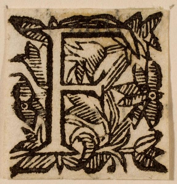
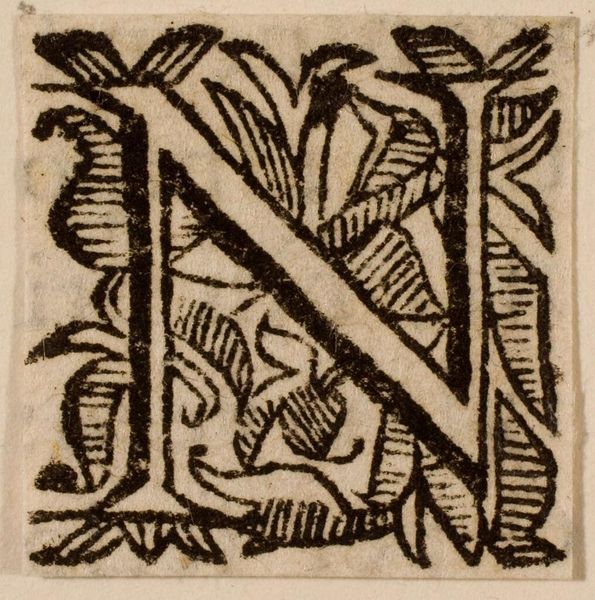
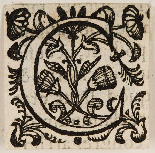
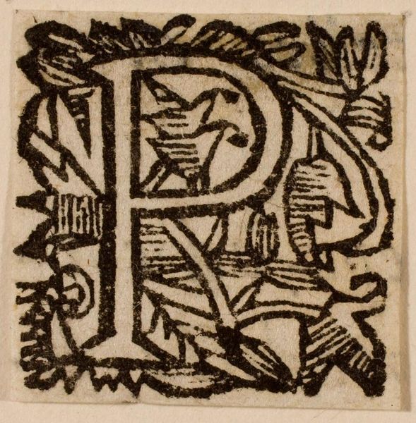
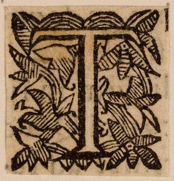
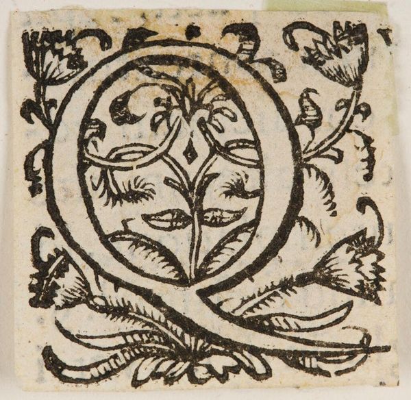
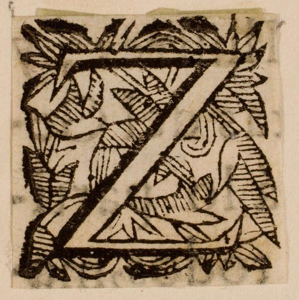
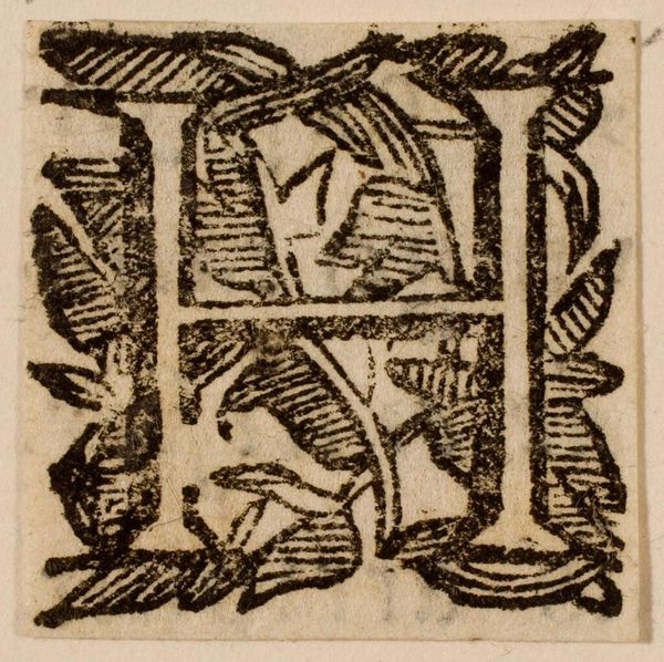
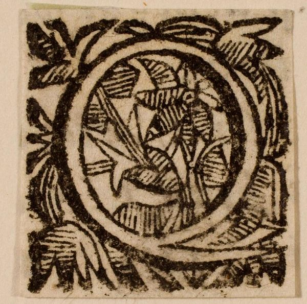
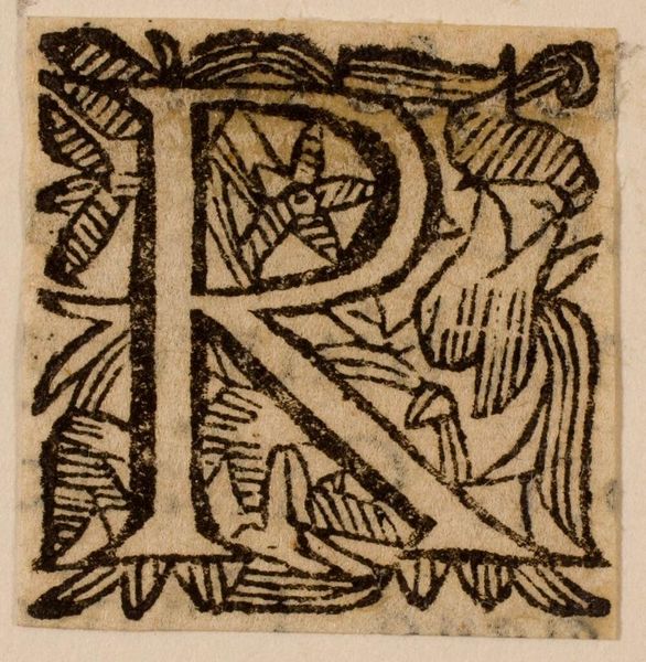
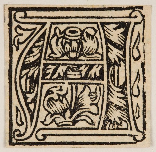
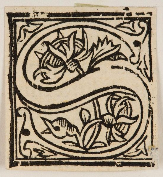
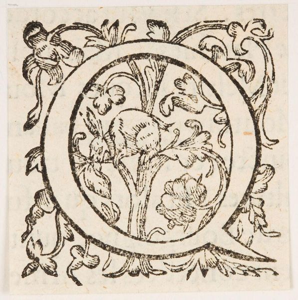
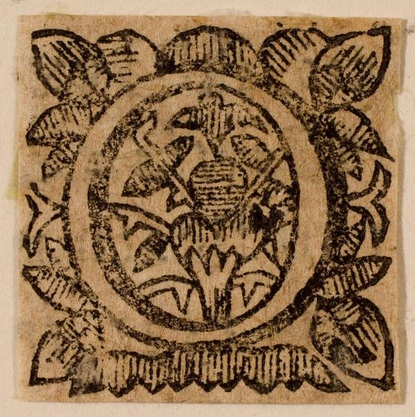
Curator: Here we have a print titled "Letter G," created by an anonymous artist. It resides in the Harvard Art Museums. Editor: It feels very tactile, even from a distance. I'm struck by the bold lines and the rough texture of what seems to be the paper. Curator: The stark contrast undoubtedly lends a sense of drama, but look at how the vegetal forms interlock to create depth and rhythm despite the flat plane. Editor: I'm also curious about the means of production. The visible texture makes me wonder about the carving process and the kind of tools used to create such defined lines. Curator: Indeed, the use of black and white heightens the graphic impact while maintaining a sense of balance and visual interest. The composition is fairly symmetrical and stable. Editor: I wonder about its intended use. It could have been part of a larger alphabet series, perhaps mass-produced for educational purposes? Curator: Perhaps. Regardless, it presents a fascinating formal interplay. Editor: I agree. It prompts questions about design, utility, and artistic labor.
Comments
No comments
Be the first to comment and join the conversation on the ultimate creative platform.
