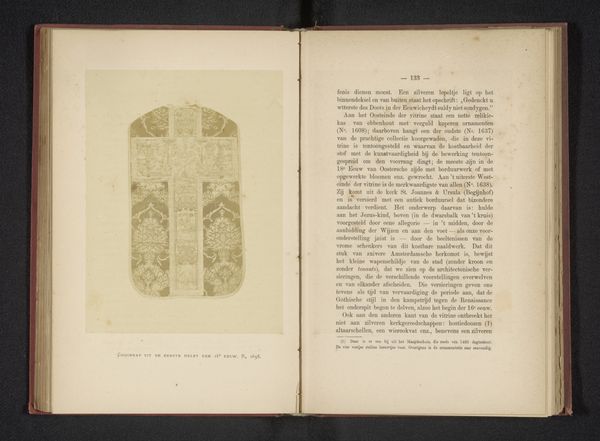
print, engraving
#
byzantine-art
#
medieval
# print
#
coloured pencil
#
watercolour illustration
#
decorative-art
#
engraving
#
miniature
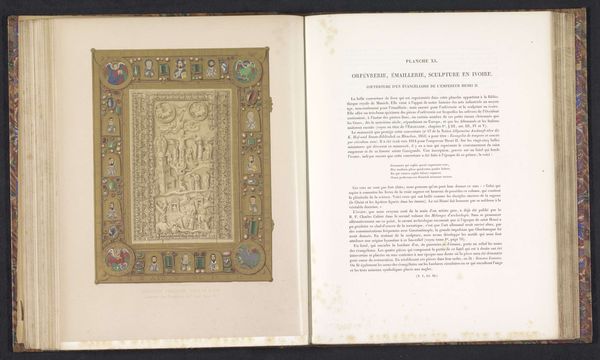
Dimensions: height 218 mm, width 166 mm
Copyright: Rijks Museum: Open Domain
Curator: This striking print depicts the cover of a gospel book, dating from before 1864 and originally hailing from the Abbey of Sankt Emmeram. The intricate design features a central figure surrounded by various religious scenes and adorned with what appears to be gems. The overall effect is quite dazzling, isn’t it? Editor: Dazzling indeed, but it's the *intentionality* of the dazzling that strikes me. It's a deliberate construction of power and authority through opulence. The geometric arrangement and shimmering surfaces create an almost oppressive visual weight. Curator: Oppressive? I see it more as reverential, reflecting the perceived value of the texts contained within. The Abbey of Sankt Emmeram was a powerful Benedictine monastery, and the production of such a lavish cover speaks to the status and influence of the church at the time. Consider how this imagery reinforces the church's role. Editor: Exactly. The church used visual language like this to assert its dominion, its access to the divine, making it purposefully unattainable to the common person. It’s all about creating an “us” and “them.” Look at the framing miniatures that echo hierarchical structures. Who is this “us”? Who does this framing hold inside or keep outside? Curator: You're right; there's certainly a clear visual hierarchy at play. But think about the craftsmanship involved. Engraving and, based on the texture, what looks like coloured pencil and watercolor. Someone poured immense skill and effort into this, labour deployed in the service of faith, power and display of wealth as power. Editor: The labour, yes. Whose labour? That's often erased in these grand displays of religious power. Who were the artists, artisans, and even the people who mined the presumed jewels? We have to account for this work. Art does not arrive on the canvas of its own accord. It arrives from the backbreaking work of usually erased bodies and usually erases bodies along with it. It has the appearance of an otherworldly occurrence. A virgin birth. But it isn’t, of course. Curator: Those are important points, and it encourages us to look beyond the surface aesthetics to understand the complexities embedded within this work. It’s more than just a pretty cover. Editor: Precisely. It is pretty. However, like every beautiful artwork, this is an opening for us to be reflective, an invitation to unravel complex systems and relations. Thank you for this insight!
Comments
No comments
Be the first to comment and join the conversation on the ultimate creative platform.
More like this