drawing, paper, ink
#
drawing
#
aged paper
#
hand drawn type
#
hand lettering
#
paper
#
11_renaissance
#
ink
#
hand-written
#
hand-drawn typeface
#
fading type
#
stylized text
#
thick font
#
handwritten font
#
northern-renaissance
#
calligraphy
#
small lettering
Dimensions: height 72 mm, width 212 mm, height 66 mm, width 211 mm
Copyright: Rijks Museum: Open Domain
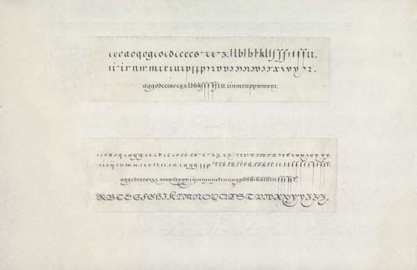
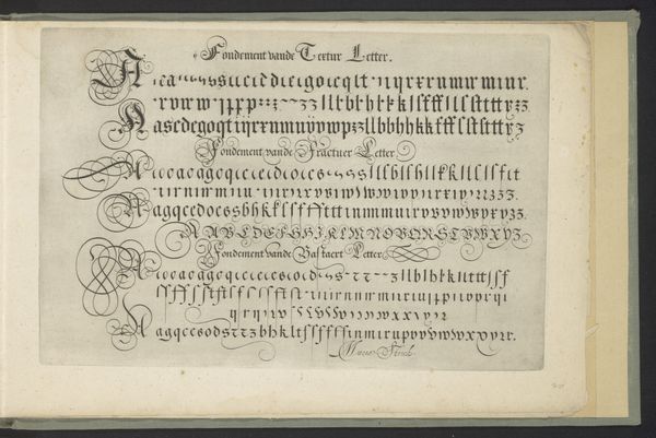
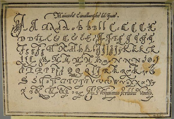
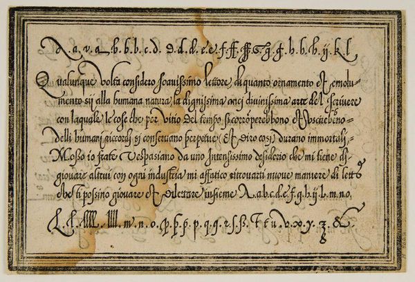
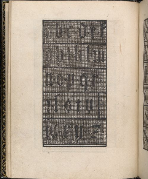
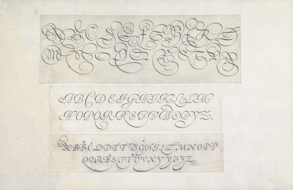
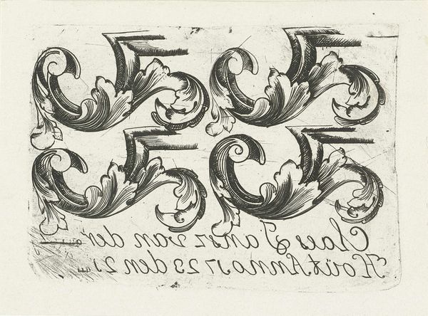
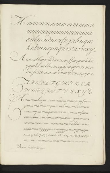
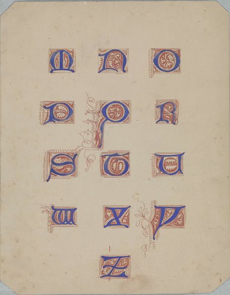
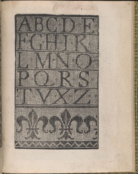
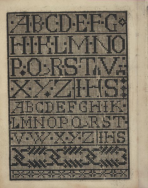
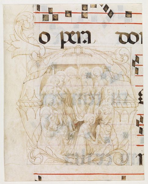
These two writing samples of textura and fraktur were created by Jan van de Velde I. In the late 16th and early 17th centuries, literacy and calligraphy weren't just about communication; they were markers of social status and education. As you can see, each letter is meticulously crafted, reflecting a time when handwriting was an art form, a key element in both personal and professional identity. These scripts, with their dense, angular forms, were not just functional; they were a deliberate choice, embodying a sense of authority and tradition that resonated with the cultural and political values of the time. The textura style, in particular, evokes the weight of history, reminiscent of illuminated manuscripts and religious texts. The fraktur is a variant of blackletter that became very popular in the German-speaking countries. Consider how these forms might have influenced perceptions of the written word, lending it an air of formality and permanence. It speaks volumes about the power of language.
Comments
No comments
Be the first to comment and join the conversation on the ultimate creative platform.
