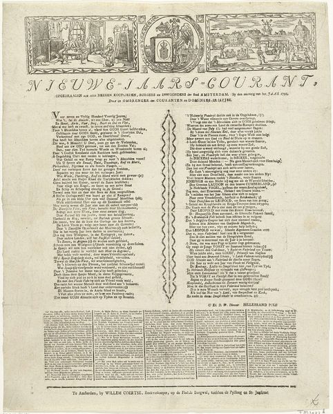
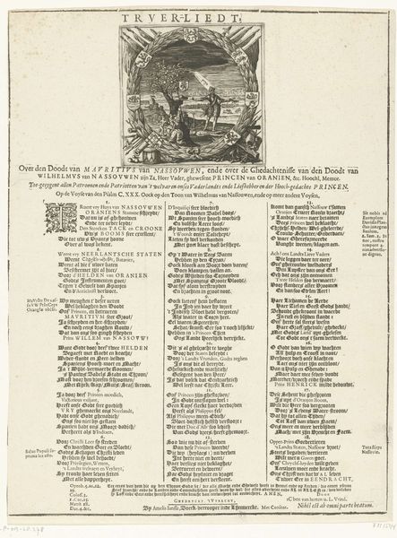
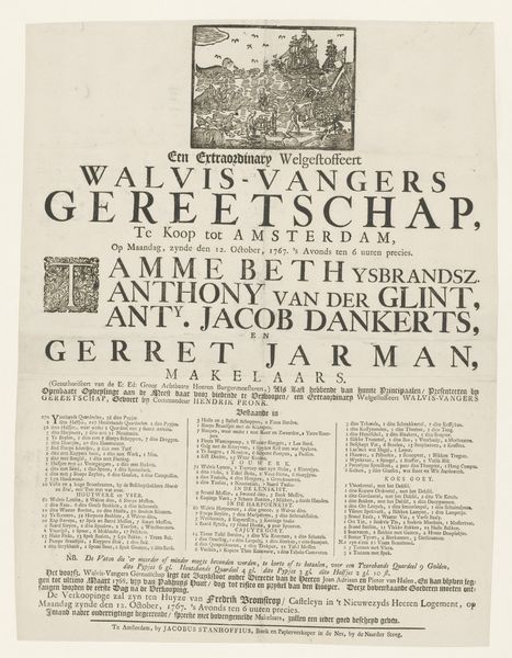
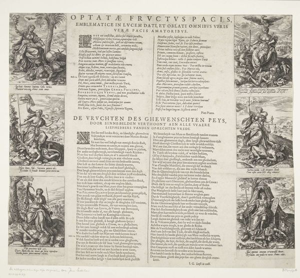
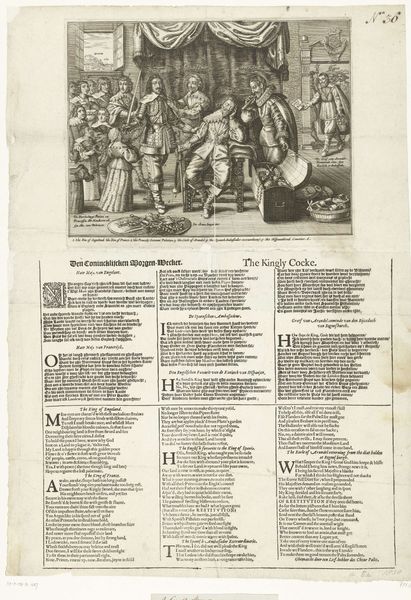
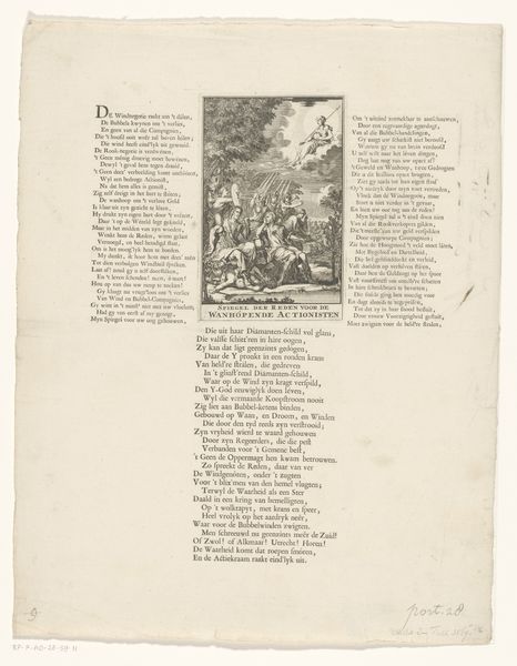
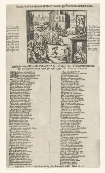
graphic-art, print, typography, engraving
#
graphic-art
#
aged paper
#
hand-lettering
# print
#
old engraving style
#
hand drawn type
#
personal sketchbook
#
typography
#
hand-drawn typeface
#
journal
#
fading type
#
sketchbook drawing
#
sketchbook art
#
engraving
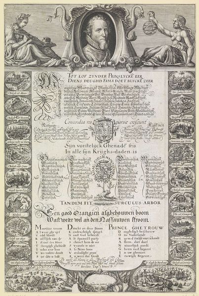
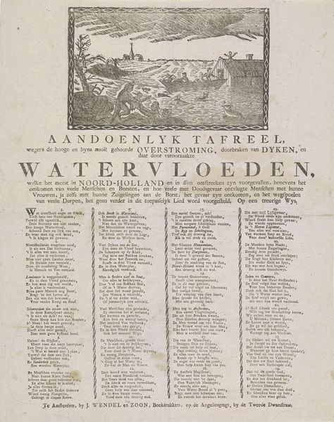
Dimensions: height 520 mm, width 434 mm
Copyright: Rijks Museum: Open Domain
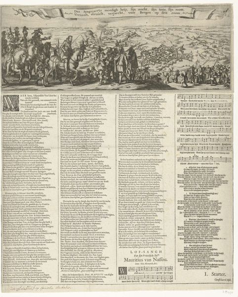
Editor: This engraving, "Treurzang op de Leidse buskruitramp, 1807," from the Rijksmuseum, is a printed lament by Jacobus Wendel on the Leiden gunpowder disaster. It's overwhelmingly text-based with small images at the top and gives a feeling of something between a news bulletin and a hymn. I find the use of type really fascinating. What can you tell me about this piece? Curator: It whispers a tale, doesn't it? Imagine holding this broadside just days after the explosion, the ink still fresh, the words raw. I imagine people gathering together reading this aloud. The typeface itself speaks volumes— a kind of hurried elegance, hand-drawn but yearning for formality. And those little vignette illustrations— almost naive in their depiction of chaos— feel like desperate attempts to visualise the unimaginable. They are glimpses through a veil of sorrow, you know? What do you make of the handwritten nature? Editor: I guess I see it reflecting a time before mass media, when news and mourning were intertwined and very personal. Like, the typography is central to the print's purpose and reflects the community mourning in Leiden, the human reaction to the tragedy itself. Curator: Precisely. Each imperfection, each tremor in the line, embodies the shock and grief felt at the time. There’s something deeply moving in that tangible connection. These were crafted objects designed for quick dissemination, the visual design reflecting a communal spirit. It becomes almost like holding a fragment of that collective grief in your hand. But do you see the contrast between the intention and final execution of the work? Editor: Now that you mention it, the contrast between the clean typeface and chaotic images is there. Like an ordered cry! Curator: Yes, exactly. The work immortalizes an effort to contain something so inherently devastating. It makes one really sit in the discomfort between order and entropy. Editor: So the art lies in its very raw presentation? It presents tragedy not sensationally, but sincerely, right? Curator: I think you hit on the right sentiment. The design serves not to exploit but rather to express a shared human experience of tragedy and how even the most visually basic approach has an innate expressiveness of loss and memorialization.
Comments
No comments
Be the first to comment and join the conversation on the ultimate creative platform.
More like this