print, photography, poster
#
portrait
#
african-art
# print
#
pop art
#
photography
#
pop-art
#
poster
Dimensions: 27 x 19 1/8 in. (68.58 x 48.58 cm) (sheet)
Copyright: No Known Copyright
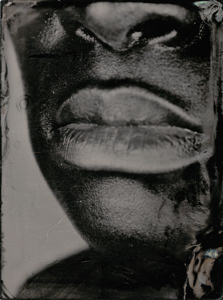
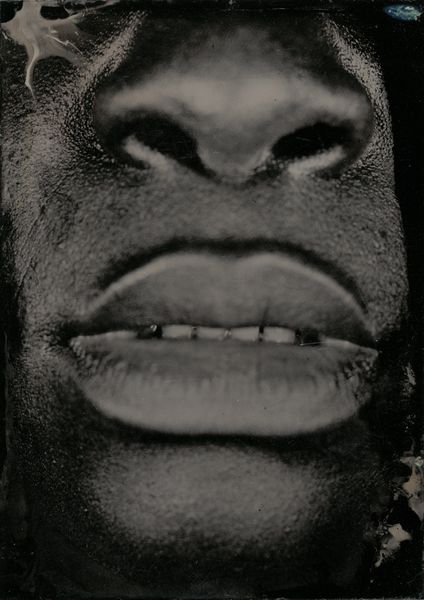
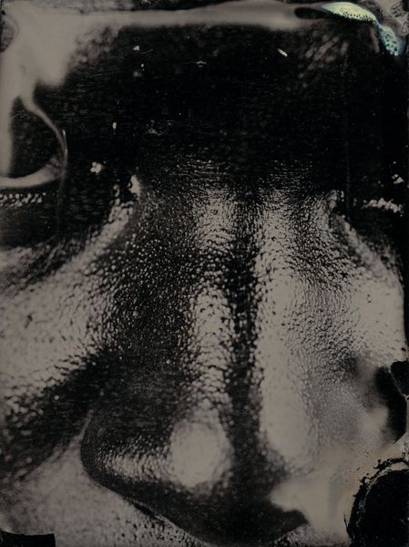
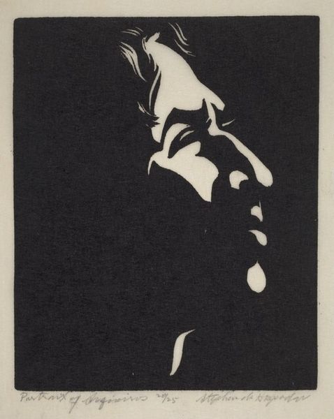
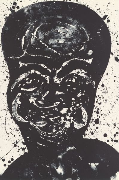
Editor: This is "Black," a print by an anonymous artist, dated around 1968, using photography. I’m immediately drawn to the contrast between the blocky title and the softer "Beautiful" above the portrait. What do you see in this piece? Curator: Note the tonal scale – the starkness of the black lettering “Black,” contrasted against the sepia rendering of the figure’s head. And how the graphic swirls spelling out "Beautiful" overlay, disrupting the surface of the figure. This layering adds depth and invites an interesting reading. What happens if we take the title away? Editor: Without "Black," we're left with a portrait labelled "Beautiful." It seems the title is necessary for the print's effect. Is it intended as social commentary? Curator: Precisely. Let us stay with our visual reading: consider the positioning of the subject – looking upward – combined with that font declaring beauty. How does it force the viewer to reconcile these graphic and representational elements? Editor: It seems like a direct challenge to dominant aesthetic values, framing Blackness itself as beautiful. Curator: I would suggest we look deeper at the formal relationships first, then develop an analysis, so the reading emerges organically. Considering the flatness inherent in Pop Art, does the title flatten the image of the person as if to objectify? How does the text’s graphic and pictorial interplay communicate to viewers on a subliminal level? Editor: So, by analyzing the artistic components, it can bring the bigger ideas and societal context into sharper focus. Curator: Precisely. Close examination of form, light, shape, and the material of the work allows us to consider what the work means, as well. The work yields meaning beyond just the topic of representation itself. Editor: That’s helpful; thank you! I’ll look more closely at how artistic choices shape meaning.
Comments
No comments
Be the first to comment and join the conversation on the ultimate creative platform.
More like this