drawing, paper, ink, pen
#
portrait
#
drawing
#
hand-lettering
#
hand drawn type
#
hand lettering
#
german-expressionism
#
paper
#
ink
#
hand-drawn typeface
#
pen-ink sketch
#
pen work
#
pen
Copyright: Rijks Museum: Open Domain
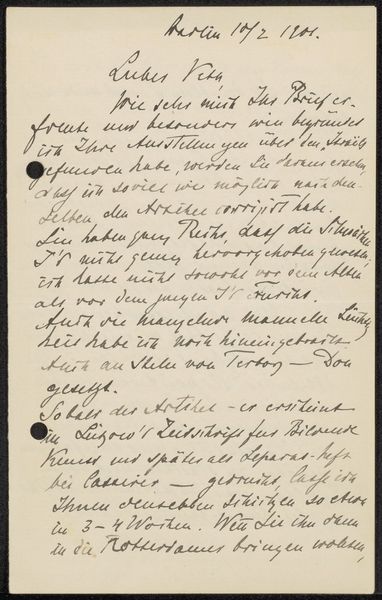
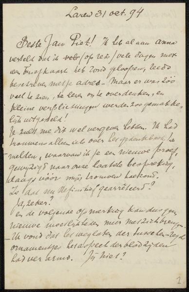
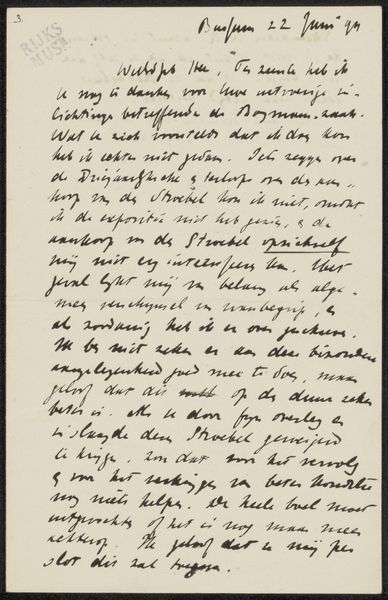
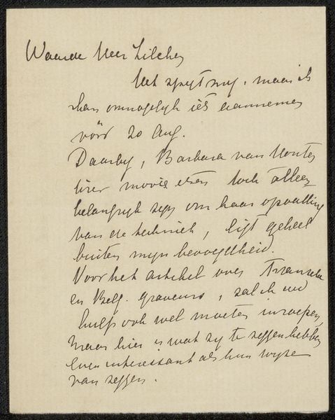
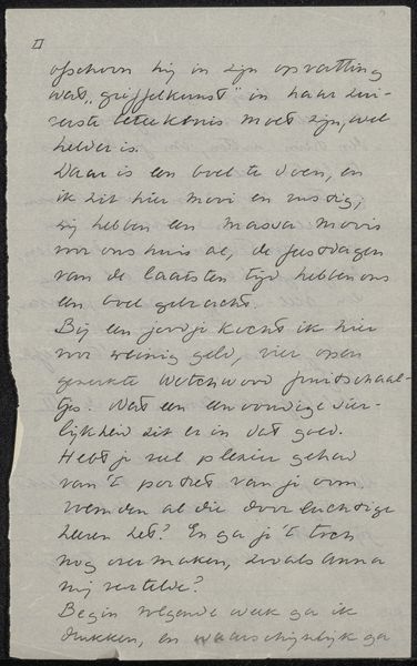
This is a letter to Jan Veth, written by Max Liebermann in 1901. The nib of his pen is quite fine, and you can see in the loops and tails of the letters how the ink pools and flows, dark and light. The text is packed densely, almost as if Liebermann were reluctant to waste any space. There is a real urgency to the way the writing is crammed together. The ascenders and descenders of the letters bump into each other, creating a kind of textured surface. I particularly like the way he forms his capital letters - the 'L' in 'Lieber', for example, or the 'N' at the start of 'Naturlich'. There's a kind of elegant simplicity there, a confidence in the mark-making. It reminds me of the way artists like Cy Twombly would use handwriting as a form of drawing. It’s like seeing him thinking.
Comments
No comments
Be the first to comment and join the conversation on the ultimate creative platform.
More like this