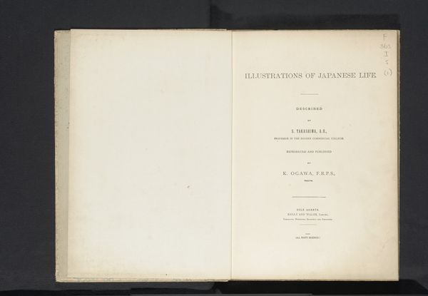
print, paper, photography
aged paper
homemade paper
paperlike
book
light coloured
landscape
paper texture
paper
photography
fading type
thick font
delicate typography
letter paper
design on paper
Dimensions: height 267 mm, width 190 mm, thickness 50 mm
Copyright: Rijks Museum: Open Domain
Curator: Here we have "Gallery of the Celebrated Landscapes of Switzerland," a print dating back to 1884 by J.A. Preuss. What are your initial impressions? Editor: Immediately, I notice the paper itself. Its creamy tone and the subtle texture suggest it's not just a ground for imagery, but an active participant in the work. It feels almost delicate, like a fragile historical document. Curator: The use of paper here speaks volumes. It reminds us that books, especially those from the late 19th century, were objects of considerable craft. The quality of the paper stock reflects the value placed on disseminating images of Swiss landscapes to a wider audience. Consider the networks involved in paper production, printing, and distribution. Editor: The typography fascinates me as well. The faded red ink, the variations in font weight and style. Look how the title is framed with such clean lines, yet the lettering has this incredible almost hand-crafted quality, hinting at traditional printmaking techniques alongside emergent mechanical reproduction. Curator: Precisely! The choice of typography aimed to evoke both modernity and established visual tropes of the era, signaling progress while simultaneously appealing to conservative aesthetic preferences among book consumers. Editor: Do you think the artist, by showcasing established landscapes, sought to capitalize on the popular picturesque movement, essentially creating a product for mass consumption? Curator: Undoubtedly. These images fulfilled a demand. They also served as powerful promotional tools, influencing perceptions of Switzerland as a destination and shaping broader understandings of nationhood and identity through consumable images. What appears sentimental at first glance actually contains a lot when you start to investigate its industrial background. Editor: This perspective truly enriches my understanding of the print. Beyond its aesthetic qualities, it becomes a valuable piece of evidence relating to 19th-century bookmaking processes and the commercialization of landscape imagery. Curator: Indeed, examining its physical existence deepens how we interpret the imagery inside its covers.
Comments
No comments
Be the first to comment and join the conversation on the ultimate creative platform.