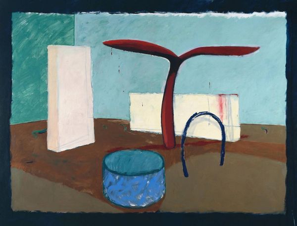
painting, oil-paint
#
painting
#
oil-paint
#
geometric
#
modernism
Dimensions: 70 x 65 cm
Copyright: Gil Nicolescu,Fair Use
Curator: Ah, “Multiplicare II” by Gil Nicolescu. Painted in 1977 with oils. You know, looking at it now, I feel this… strange comfort? Editor: Comfort? My first thought was sterile conformity. It looks like a commentary on the homogenization of society. Look at these figures—each a near copy of the last, draining all character away until only similar forms remain. Curator: You see uniformity, but I feel repetition that’s almost… hypnotic. The geometric shapes become softer in the earth tones. And isn’t there something quite satisfying about how they mirror each other? I imagine the artist perhaps sought comfort in the order, like visual meditations… a yearning for calm amid what I assume was likely chaotic world happenings at the time? Editor: If we consider that this piece was created in '77, yes, the spectre of totalitarian regimes and the cultural landscape during late modernism are absolutely factors. This constant visual echoing you feel… It can be read as oppressive sameness rather than reassuring rhythm. There’s very little indication of an escape for anyone standing in that long line of sameness; it makes it difficult to look at directly. Curator: But is escape always the goal? Maybe there's a perverse kind of liberation, maybe that wasn’t the artists’ perspective but the piece asks to explore acceptance within similar structures, a study of unity and diversity despite appearances of exactness. It has this echo about how we often seek harmony in places, or things that we find most resistance to. Editor: Or perhaps the system seeks conformity. In other words, maybe that sense of perverse liberation in homogenization is not liberation, but a state of delusion we’ve come to passively participate in— Curator: Maybe! The color choices, these muted, earthly tones though, bring warmth, a grounded feel! There’s life here. Editor: See, even the color palette invokes a sense of inescapable “beige-ness” of bureaucratic existence, so from an activist standpoint this creates an eerie atmosphere with almost robotic figures trapped between rigid structure and design… something many continue to relate to on a global scale. It's almost kafkaesque. Curator: Interesting—it truly does open itself up to very varied perceptions; even in our difference of viewpoint, it almost perfectly captures this intersection of intent, social circumstance, and personal interpretation, doesn't it? Editor: Yes, absolutely. This highlights the ongoing need for critical lenses that unpack the visual systems around us; whether for compliance, complicity, or both.
Comments
No comments
Be the first to comment and join the conversation on the ultimate creative platform.
More like this