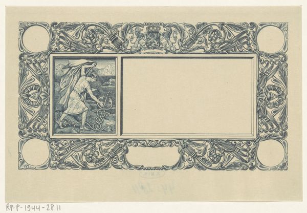
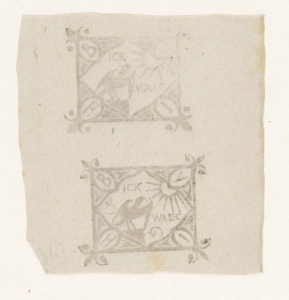
graphic-art, print, etching
graphic-art
art-nouveau
etching
old engraving style
etching
figuration
Dimensions: height 103 mm, width 188 mm
Copyright: Rijks Museum: Open Domain
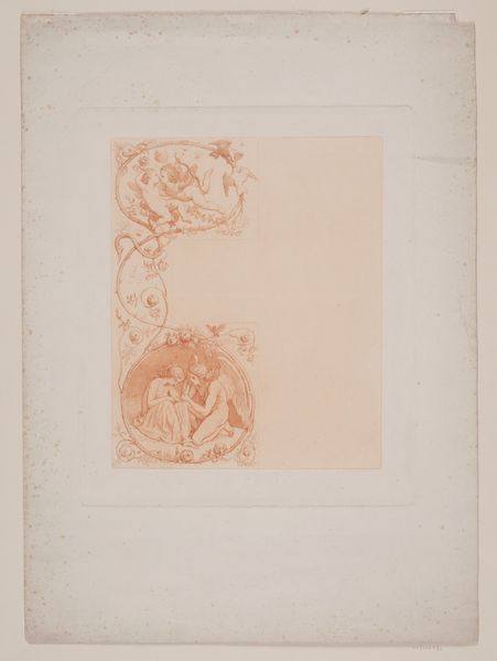
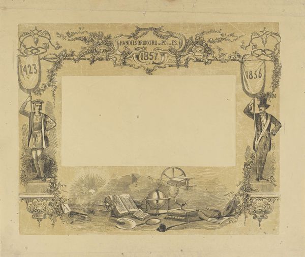
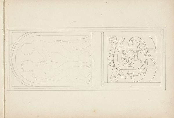
Editor: We’re looking at "Voorzijde van een bankbiljet van vijfentwintig gulden," a Dutch banknote design by Pieter Dupont, dating from around 1910-1915. It's an etching and print, very delicate, and in a distinctive Art Nouveau style. It gives the impression of a frame, almost like something precious is to be placed within. What do you see when you examine this work? Curator: Intriguing, isn't it? Structurally, the artist establishes a firm visual framework through the detailed border and corner embellishments. Note how Dupont deploys the symmetry in the Art Nouveau floral motifs, only slightly offset by the vignette on the left. Editor: You mean the woman figure? Curator: Precisely. This asymmetrically placed figurative element offers a dynamic contrast. Her flowing garment, combined with the intricate linework of the etching technique, lends dynamism. The question is, why? What effect does this offset dynamism create? Editor: It keeps the eye moving, disrupting what might be a static design? It also seems like there’s a lot of unused space in the middle of the frame that’s distracting. Curator: True, but that emptiness is not accidental. Consider it as a conscious compositional tool. By emphasizing void, Dupont is also, implicitly, pointing at what matters to be placed *within* this designed border; here would be the official marks, monetary denominations, security features and so on that legitimize an official banknote. Do you think this emphasis creates any tension between decoration and function? Editor: I see, that empty space has an intentional purpose for practical function and securing it. So, it’s not *really* empty; it’s more a place that's yet to be occupied to render it legit. It shows that it needs the authority, without which it’s only a decoration! Curator: Precisely. Looking beyond representation of that feminine form toward semiotic and textual concerns encourages us to read more deeply into this "void" on this interesting work. Editor: I will surely consider how this "void" invites a new meaning. Thank you for shedding light on the importance of negative space here.
Comments
No comments
Be the first to comment and join the conversation on the ultimate creative platform.