Copyright: CC0 1.0
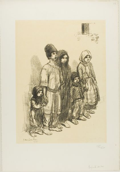
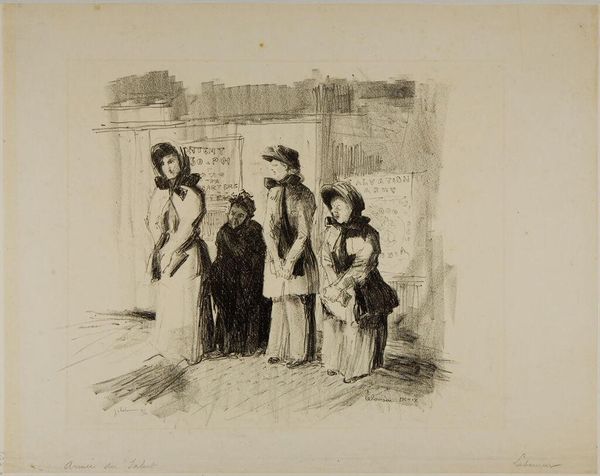
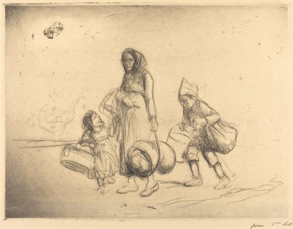
Editor: This is Théophile Alexandre Steinlen’s "French Children," from the Harvard Art Museums. It looks like a pen and ink drawing, and I'm struck by the way the figures are arranged, almost like a frieze. What compositional elements stand out to you? Curator: The linear arrangement is indeed crucial. Note the artist's use of varying line weights and densities to create depth and texture, especially in the children's clothing. How does the restricted palette influence your reading? Editor: It creates a somber mood, almost like a study of light and shadow. I guess I'm wondering what the relationship is between the figures and their setting, which is so stark. Curator: The setting, rendered minimally, serves primarily as a spatial anchor. The focus remains on the figures, their forms, and their relationships. The hatching technique creates subtle tonal gradations, drawing us into the nuances of their expressions. Editor: I see that now. Thanks, I have a better appreciation for how Steinlen uses simple means to create a visually engaging composition. Curator: And I'm glad to have considered the starkness of the setting alongside its impact on the figures.
Comments
No comments
Be the first to comment and join the conversation on the ultimate creative platform.
More like this