Copyright: Guido Molinari,Fair Use
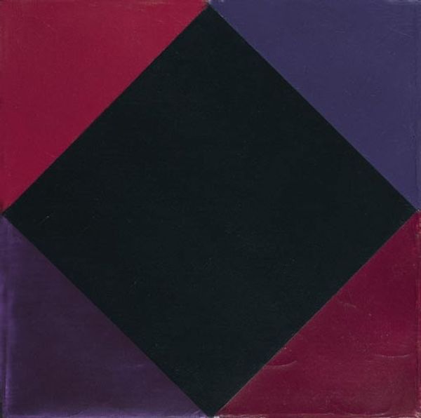
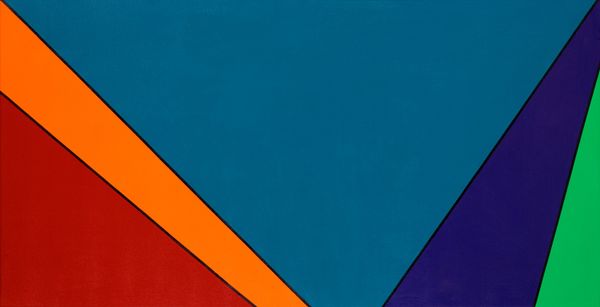
Curator: Guido Molinari’s “Opposition triangulaire” from 1971—a geometric abstraction rendered in acrylic. It's quite a striking piece. Editor: My initial sense? Warm and cool duking it out. There’s something unsettlingly off-kilter about it. Curator: The title hints at that tension, doesn't it? Consider the composition: a square canvas neatly divided into four triangles, each a distinct colour – blue, orange, brown, and a faded pink – arranged around a central point. There is a system at work. Editor: Exactly. Yet, that strict geometric order doesn’t quite achieve visual harmony, does it? The colour choices feel deliberate but just slightly abrasive, particularly the blue fighting that intense orange. Is it just me? It’s almost… aggressively balanced? Curator: Not at all. It's a dance between order and dissonance that characterizes a lot of hard-edge painting. Molinari sought to explore pure visual relationships, stripping away narrative to focus on colour interaction. It really emphasizes the materiality, and the formal elements. Editor: So, it’s not just about aesthetics, but the very nature of perception itself? Makes me think about a kaleidoscope, fracturing and reforming with each tiny shift, constantly challenging what constitutes visual coherence. Curator: Precisely. And within the history of Colour Field Painting—where colour is the subject—he wanted to push viewers to feel, rather than passively observe colour. Editor: Which he pulls off, I must say. Those hard-edged, flat areas practically vibrate against each other. If I try to settle on any of the colors to enjoy it quietly, there is just no possible rest. They demand activity from the eyes! Curator: Molinari encourages that dynamism. Seeing, according to this work, is far from a passive reception, it's about tension. He definitely achieved that. Editor: Well, the painting has definitely stirred my attention, questioning the visual field itself with those sharp, competing triangles of colors! Curator: It certainly offers a striking glimpse into his focus with material forms, doesn't it?
Comments
No comments
Be the first to comment and join the conversation on the ultimate creative platform.
More like this