About this artwork
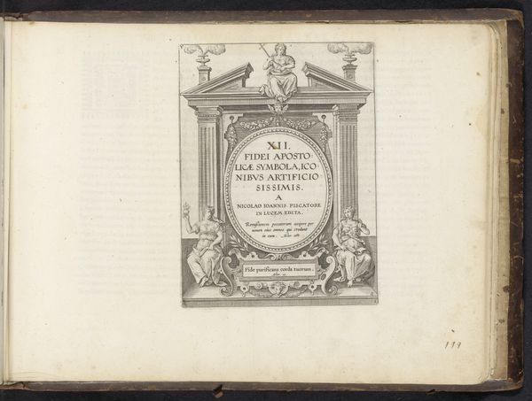
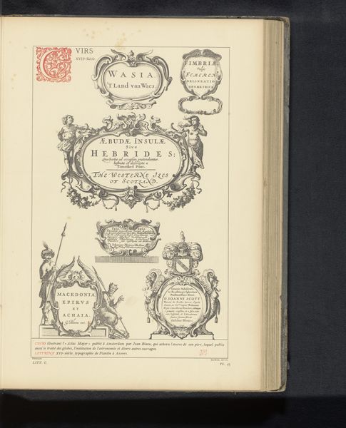
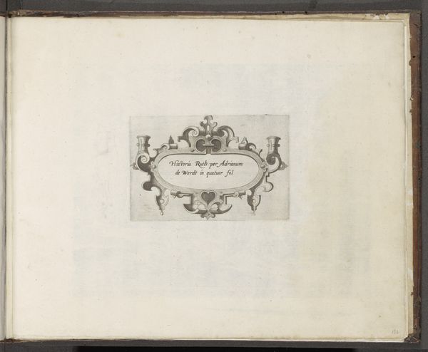
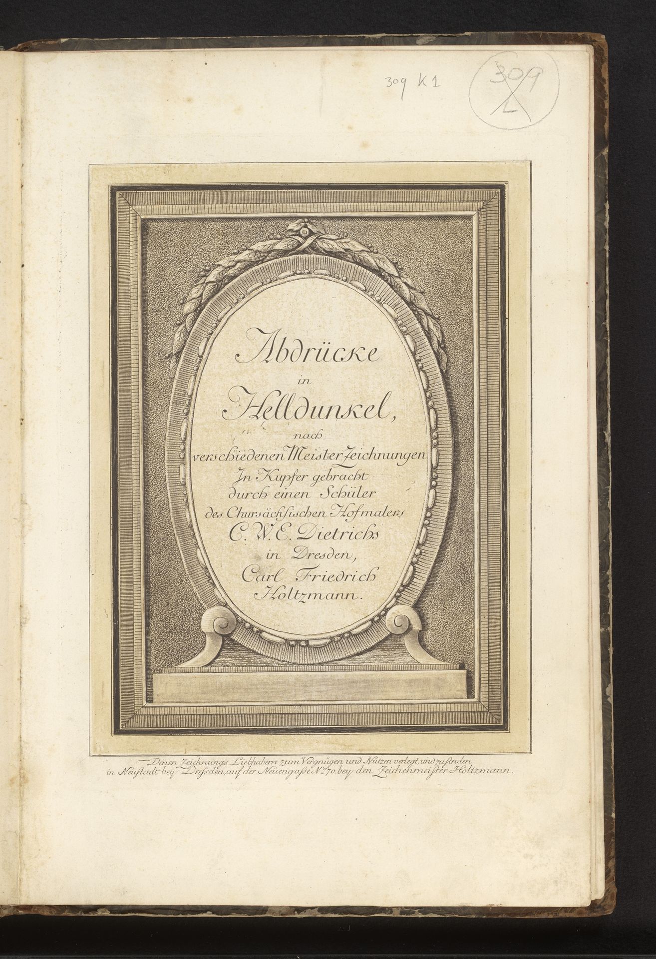
Editor: So, this is Carl Friedrich Holtzmann's "Titelprent voor de prentserie 'Prenten in clair-obscur'," made sometime between 1750 and 1811. It's an etching, engraving, and drawing, all on paper. What strikes me is how contained it feels, with all those frames. What do you see in its structure and form? Curator: Precisely. Note the interplay of geometric forms—the rectangular frame versus the oval cartouche. This contrast is further emphasized by the texture. The crisp, linear engraving of the outer frame is set against the softer, more atmospheric treatment within the oval. This is where the "clair-obscur," the light-dark effect, truly comes into play. Consider the hierarchy established; which form dominates and why? Editor: I guess the rectangle encloses everything and feels most stable. But isn't the oval with the text the real subject of the work? It draws your eye. Curator: Yes, and consider the lettering within the oval. How does the font choice contribute to the overall design? Observe how the arrangement of text divides the pictorial space, and consider the weight each word carries. Does the formal arrangement affect our reading of the piece? Editor: I hadn't thought about it that way. It's almost like the lettering *is* the image. Seeing how you break down those forms gives me a better handle on the whole composition, instead of just glancing at it. Curator: Indeed. The formal elements dictate the reading, wouldn't you agree? A work like this compels us to attend to its visual mechanics before leaping to any conclusions about content. Editor: Definitely. Thanks; it's been illuminating. Curator: My pleasure; always rewarding to closely analyze such crafted compositions.
Titelprent voor de prentserie 'Prenten in clair-obscur'
1750 - 1811
Artwork details
- Dimensions
- height 217 mm, width 280 mm
- Copyright
- Rijks Museum: Open Domain
Comments
Share your thoughts
About this artwork
Editor: So, this is Carl Friedrich Holtzmann's "Titelprent voor de prentserie 'Prenten in clair-obscur'," made sometime between 1750 and 1811. It's an etching, engraving, and drawing, all on paper. What strikes me is how contained it feels, with all those frames. What do you see in its structure and form? Curator: Precisely. Note the interplay of geometric forms—the rectangular frame versus the oval cartouche. This contrast is further emphasized by the texture. The crisp, linear engraving of the outer frame is set against the softer, more atmospheric treatment within the oval. This is where the "clair-obscur," the light-dark effect, truly comes into play. Consider the hierarchy established; which form dominates and why? Editor: I guess the rectangle encloses everything and feels most stable. But isn't the oval with the text the real subject of the work? It draws your eye. Curator: Yes, and consider the lettering within the oval. How does the font choice contribute to the overall design? Observe how the arrangement of text divides the pictorial space, and consider the weight each word carries. Does the formal arrangement affect our reading of the piece? Editor: I hadn't thought about it that way. It's almost like the lettering *is* the image. Seeing how you break down those forms gives me a better handle on the whole composition, instead of just glancing at it. Curator: Indeed. The formal elements dictate the reading, wouldn't you agree? A work like this compels us to attend to its visual mechanics before leaping to any conclusions about content. Editor: Definitely. Thanks; it's been illuminating. Curator: My pleasure; always rewarding to closely analyze such crafted compositions.
Comments
Share your thoughts