drawing, paper, ink
#
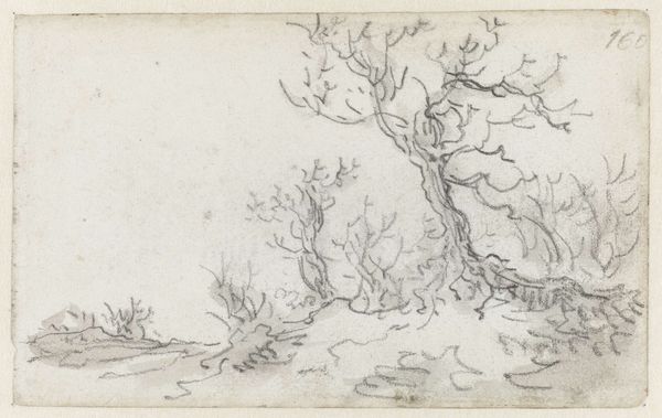
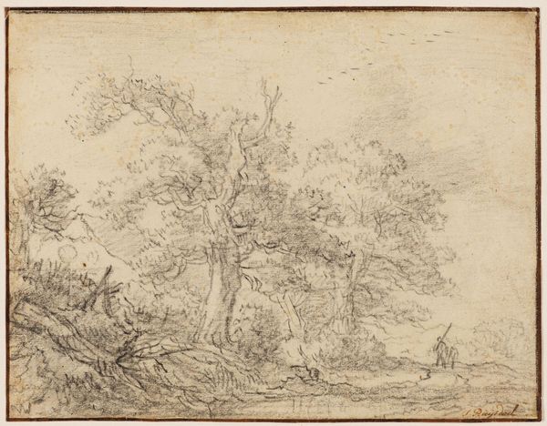
tree
#
drawing
#
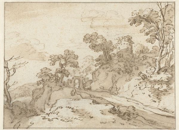
baroque
#
pencil sketch
#
landscape
#
paper
#
ink
#
pen-ink sketch
#
mountain
#
watercolor
Dimensions: height 137 mm, width 210 mm
Copyright: Rijks Museum: Open Domain
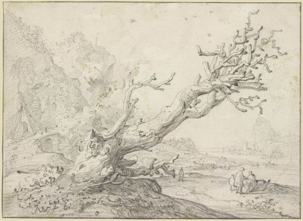
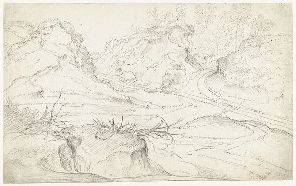
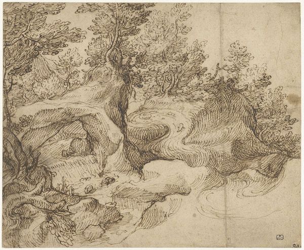
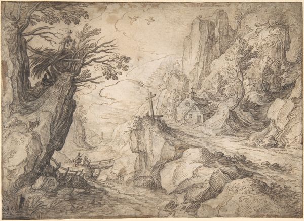
Curator: Here we have a 17th-century landscape drawing by Monogrammist BVB, titled "Bergachtig landschap met op de voorgrond een kale boom," which translates to "Mountainous landscape with a bare tree in the foreground." Editor: My immediate impression is one of stark beauty. The skeletal tree dominating the foreground contrasts so dramatically with the faint, almost dreamlike mountains in the distance. It's as though transience and eternity are placed side by side. Curator: Exactly. The artist's masterful use of ink on paper creates a detailed study in contrasts. Look closely at the lines: thin, almost hesitant strokes forming the distant mountains and then these bold, confident marks defining the tree's gnarled branches. The structural elements are clearly defined by their relationship to the linework used in their production. Editor: It makes me wonder about the conditions in which it was created. The cost of paper, the availability of quality ink. We are seeing a luxury good here that allows this sort of material reflection, a study facilitated by relative access and excess. What kind of patrons commissioned landscapes such as this? Curator: That’s a fair assessment. While a direct answer may remain elusive, it is worth exploring the compositional choices at play within this image. Notice the tree itself; it's not merely a visual element, but acts as a framing device. It leads the eye toward the receding landscape and anchors the entire composition. This also reinforces the sense of spatial recession. The composition functions semiotically. Editor: True, but the material reality is also evocative. Look at the deliberate texture that suggests weathering and time. It creates a tactile quality, even in this two-dimensional rendering. Consider how the artist achieved that. Curator: Indeed, the materiality supports the emotional impact. The scene feels both desolate and resilient. Editor: Thinking about this artwork as an object really reframes the way I understand it. Curator: And reflecting on it structurally sheds light on why its visual arrangement impacts the overall message. It’s rewarding to consider both the making and the appearance.
Comments
No comments
Be the first to comment and join the conversation on the ultimate creative platform.
More like this