Dimensions: height 113 mm, width 159 mm
Copyright: Rijks Museum: Open Domain
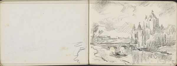
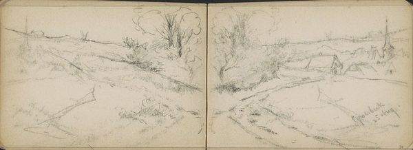
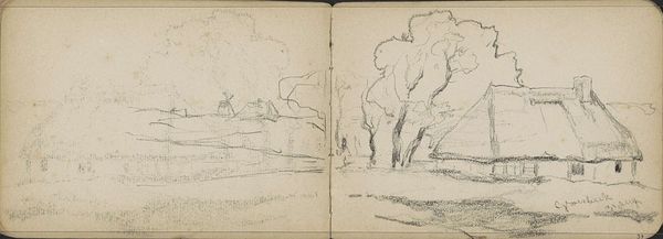
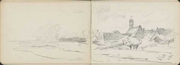
Editor: Here we have Willem Cornelis Rip’s "Brug bij Steenbergen", a graphite drawing created around 1896-1897. It’s interesting to see an impressionistic style used in a drawing rather than painting. What catches your eye, looking at this work? Curator: The composition. The use of the sketchbook’s central crease as a vanishing point is particularly compelling. The implied lines lead our eye directly into the represented space. The graphite work, although delicate, possesses a clear structure. Note the varying densities that establish form, moving beyond pure contour. How do you perceive the materiality of the work itself? Editor: I think the roughness of the medium helps capture the fleeting quality of an impressionistic landscape. The loose application lends an atmospheric quality that feels very transient. But is the division down the middle intentional? Or just an unavoidable aspect of the sketchbook? Curator: Functionally, the sketchbook’s format enables a bilateral symmetry, subtly reinforcing the bridge motif. The left and right panels offer a visual mirroring, establishing balance within the sketch. Consider the spatial effect. Are we looking *at* the scene or being invited to step into it? Editor: I see what you mean about stepping into the space. That central line functions as a kind of path. It pulls me in. I hadn't really thought about how the physical form of the sketchbook adds to the meaning of the drawing. Curator: Exactly. By examining how form shapes our engagement with this landscape we begin to more clearly apprehend the artistic decisions made by Rip.
Comments
No comments
Be the first to comment and join the conversation on the ultimate creative platform.
More like this