Bandontwerp voor: Hans Borrebach, Lony zegt de huur op. Roman voor oudere meisjes, 1954 before 1954
0:00
0:00
drawing, graphic-art, paper, typography, poster
#
portrait
#
drawing
#
graphic-art
#
paper
#
typography
#
geometric
#
poster
#
modernism
Dimensions: height 332 mm, width 245 mm
Copyright: Rijks Museum: Open Domain
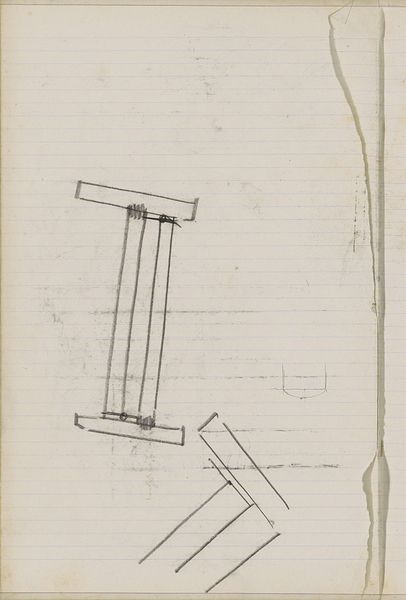
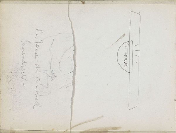
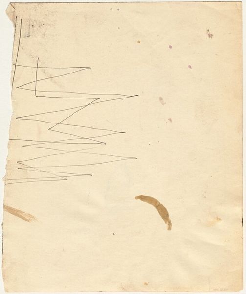
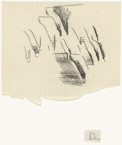
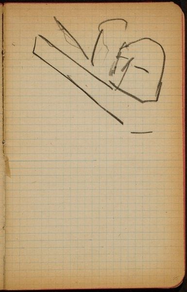
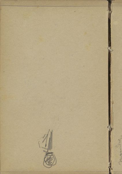
In 1954, Hans Borrebach made the band design for “Lony zegt de huur op. Roman voor oudere meisjes” using graphic techniques. There is something really pleasing about the way this design stages its own making. The brushes resting on the palette tell us a story about a process of artistic production, but in such a controlled, graphic way. It’s like Borrebach is giving us the tools but holding back the messy materiality of painting itself. Look at those ruled lines, almost like architectural drawings, set against the smooth off-white ground, these add to the overall sense of coolness. It’s an image about the idea of art rather than the real thing. I’m reminded of Saul Bass and other graphic designers working in the mid-century, whose work transformed the look and feel of everyday life. Art like this reminds us that design is everywhere, shaping how we see and experience the world.
Comments
No comments
Be the first to comment and join the conversation on the ultimate creative platform.
More like this