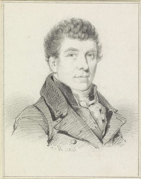
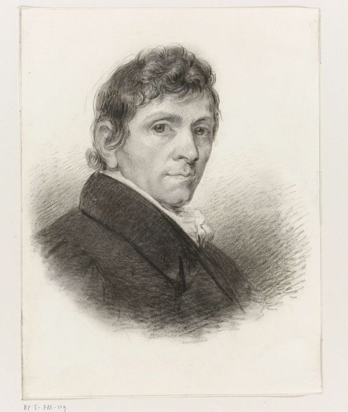
drawing, pencil
#
portrait
#
drawing
#
neoclacissism
#
pencil drawing
#
pencil
#
portrait drawing
#
academic-art
Dimensions: height 380 mm, width 270 mm
Copyright: Rijks Museum: Open Domain
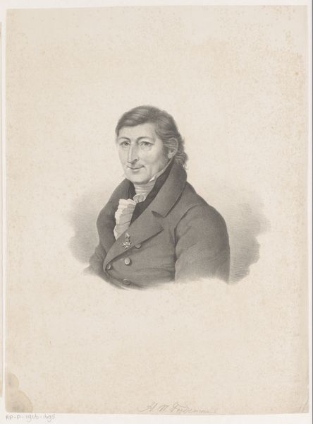
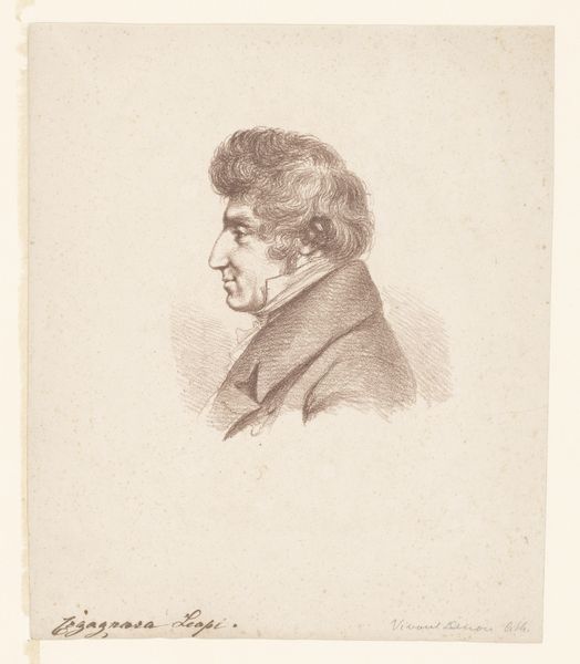
Editor: Right, next up we have a self-portrait of Willem Bartel van der Kooi, made sometime after 1819. It's a pencil drawing and, you know, it has this very proper, almost stern feel to it. The neat lines make it appear to be classical, despite the soft use of pencil to convey realism. What’s your take on this portrait? Curator: Stern, yes, that’s a good starting point. It reminds me of an era grappling with ideals, holding a mirror to itself with neoclassical severity... and perhaps a quiet smirk, detectable by viewers sensitive to nuance. It's almost as if he's inviting us into a secret. But consider the medium - humble pencil rather than a grand oil. It’s like serving cake on fine china only for one’s self. Is this self-deprecation or subtle showmanship? Editor: I never thought of that. So, the choice of pencil adds another layer. Is that typical of Neoclassical portraits, or is Van der Kooi doing his own thing? Curator: A mixed bag. Neoclassicism reveled in the stark clarity of line, often associating it with the purity of Greek sculpture, even when in color; pencil then becomes an intriguing translation. The limitations become his strength. Notice how he coaxes light and shadow out of mere graphite – transforming simplicity into subtle volumes and almost a living expression. One could assume he may have been quite comfortable exploring the many nuances of realism! Editor: So, it's about embracing simplicity. I’m seeing that now! Thanks, this makes me want to see his other drawings to consider just how nuanced he may be… Curator: Exactly. It invites us to rethink the period, and to recognize artists whose whispers are often drowned out by louder, more colorful voices, allowing us the space to create our own conversations, too!
Comments
No comments
Be the first to comment and join the conversation on the ultimate creative platform.
More like this