drawing, print, ink, engraving
#
portrait
#
drawing
#
narrative-art
#
baroque
# print
#
pen illustration
#
old engraving style
#
figuration
#
ink
#
line
#
engraving
Dimensions: height 390 mm, width 265 mm
Copyright: Rijks Museum: Open Domain
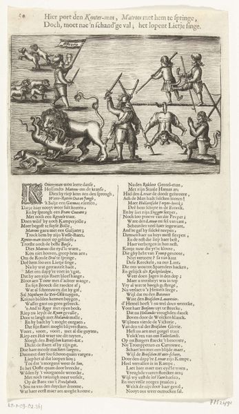
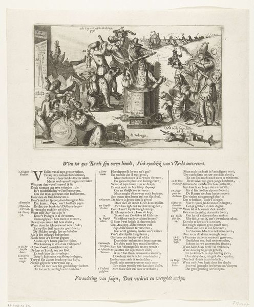
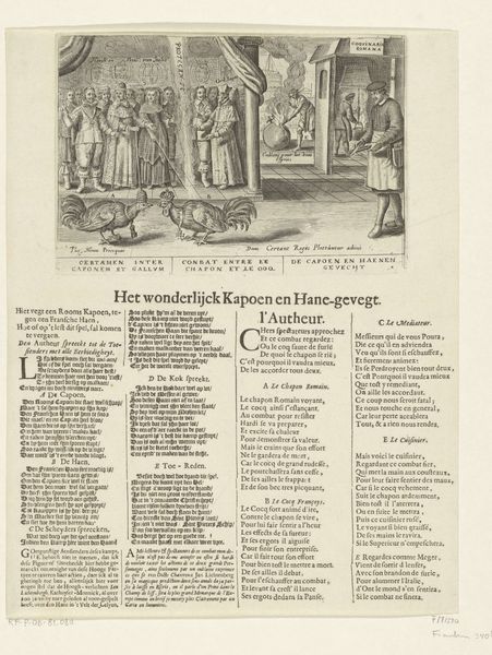
Curator: Here at the Rijksmuseum, we have a rather fascinating engraving titled "Nieuwjaarsprent van de Haarlemse schutterij, 1625," dating back to, unsurprisingly, 1625. It's a New Year's print depicting the Haarlem Civic Guard. Editor: My first impression is that it’s incredibly busy, yet orderly. The composition is crammed with figures and details. The line work creates a sense of dynamic energy despite being monochromatic. A world bustling with a distinctly archaic gravity, maybe even a sense of baroque theatricality. Curator: Exactly. As a New Year's greeting, this print serves as a kind of visual contract, doesn't it? A renewal of civic duty, martial prowess, and communal identity. The symbolism is so rich; look at the coats of arms, each representing different factions or guilds within Haarlem. Editor: The shields definitely lend an air of established power. They almost function like heraldic devices, anchoring the chaotic scene above with concrete symbols of identity. Do you find that the visual stratification—the text at the bottom, the heraldry, and the active scene above—creates a coherent whole? Curator: Absolutely. It's about layered meaning. The text beneath isn’t merely descriptive; it serves as a poetic exhortation, linking the image to specific virtues and expectations for the coming year. This work is not only about looking but about reading and interpreting. The marching soldiers are symbolic of strength and order. Editor: You’re right; the typography almost becomes another visual element. Looking at the figures, I’m curious about the stylistic choices. They possess a certain elongated quality, contributing to the controlled chaos of the scene. It’s not aiming for photorealism but an intensified version of reality. Curator: Yes, that deliberate stylization aligns it with the period's conventions for depicting power and civic virtue. Notice how even the folds of the clothing become almost calligraphic, adding another layer of intricacy to the overall design. It’s almost a diagram for good governance and community harmony. Editor: I can see it that way, the diagram brings it to life, giving the viewer the context needed to have an understanding and deeper insight of its social environment. This discussion gave me new appreciation for it, almost inviting me to delve into art historical text for additional knowledge and even a deeper view of its symbolism. Curator: And for me, it's reaffirmed the importance of seeing these prints as vital artifacts. Each element communicates something specific about their place and time. The level of planning and craft is incredible.
Comments
No comments
Be the first to comment and join the conversation on the ultimate creative platform.
More like this