

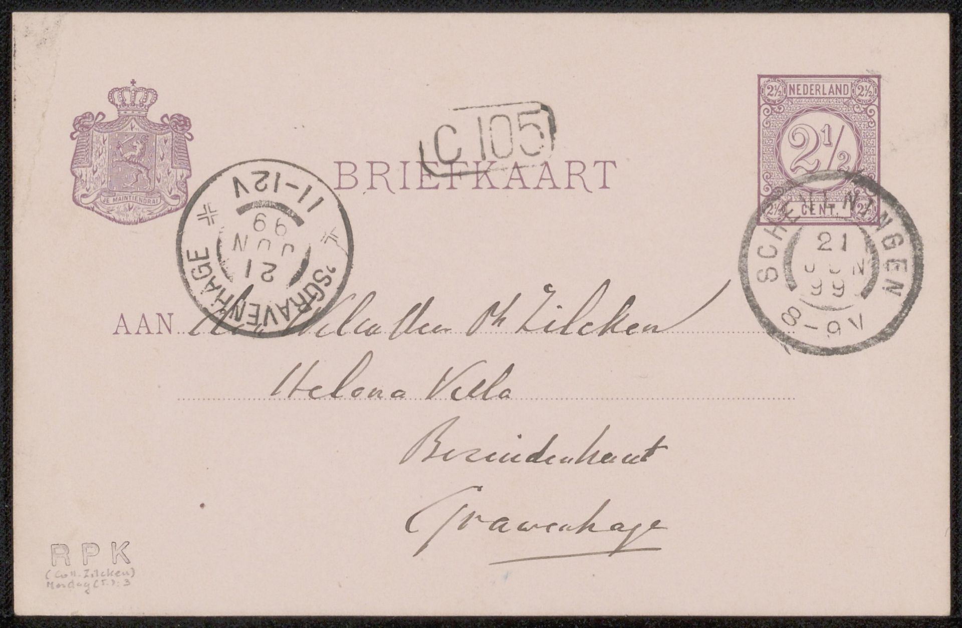
Possibly 1899
Briefkaart aan Philip Zilcken

Listen to curator's interpretation
Curatorial notes
Curator: Here we have a drawing by Taco Mesdag, believed to date from possibly 1899. It is rendered in ink on paper and is titled "Briefkaart aan Philip Zilcken." What's your first reaction? Editor: There's a delicacy, a personal feel, even at this scale. I immediately think of intimate communication, little secrets passing between people. The stampings give a sense of officialdom overlaying something very personal. Curator: Precisely. The calligraphy style really speaks to the aesthetic values of the time. It presents an interesting structural exercise too—how these elegant letterforms coexist with the blocky, utilitarian print. The layout itself seems quite deliberately asymmetrical. Editor: Asymmetrical, but balanced. All the royal symbols and postage marks, are visual declarations. Consider the lion crest – a clear assertion of Dutch identity, anchoring the personal message within a framework of national pride and bureaucratic procedure. It almost elevates the recipient's name, placing it within a sphere of national importance. Curator: Indeed. If we deconstruct the visual components, the systematic, regimented design of the stamp, as opposed to the handwritten flourishes, provides a dichotomy of rigidity against organic form. This generates, through juxtaposition, tension. Editor: Tension but also unification! It is unified in tone, as if Mesdag wanted the official apparatus to ennoble the message. The layering of the circular postmarks atop the address infuses it with history and transit—a journey memorialized. These small circles are like moments frozen in time, literally stamping the passage of the letter. Curator: A valid observation. Note also, the absence of color further directs attention to line and shape, strengthening the piece's compositional elements. Stripping the drawing to a palette of monochrome allows for closer scrutiny of form. Editor: It allows those stark forms to evoke strong emotions. It suggests not just a communication, but a cherished memento of relationship and correspondence. Looking at the marks, I wonder what other messages and missives were sent along similar routes, across similar surfaces. Curator: A worthwhile ponderance. Seeing this piece really demonstrates the ability of simple forms, like writing on a piece of paper, to be much more. Editor: Absolutely. I leave now contemplating all that this artifact could say, had it a voice to elaborate!