drawing, graphic-art, ink, engraving
#
drawing
#
graphic-art
#
baroque
#
pen drawing
#
old engraving style
#
form
#
ink
#
line
#
decorative-art
#
engraving
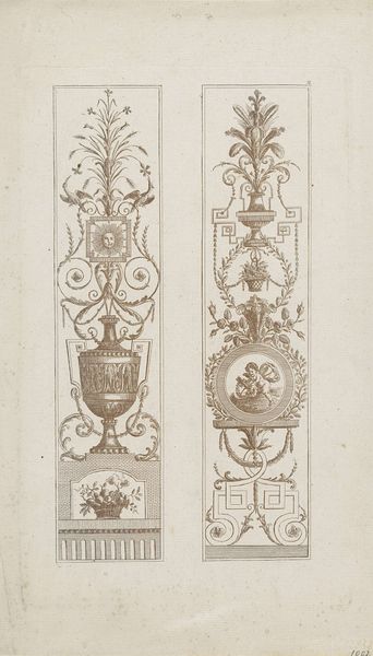
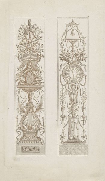
Dimensions: height 223 mm, width 163 mm
Copyright: Rijks Museum: Open Domain
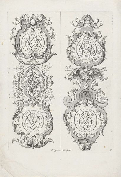
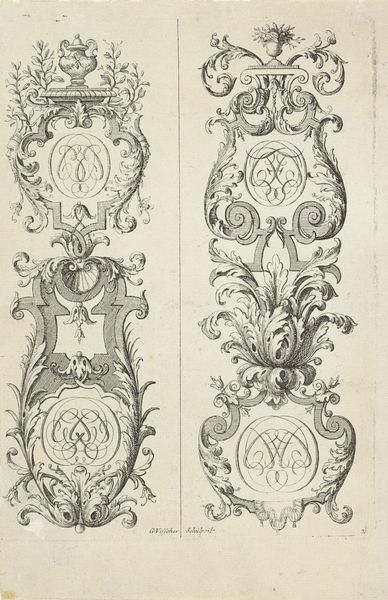
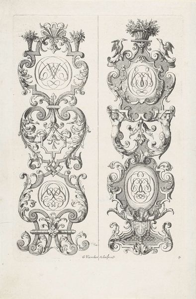
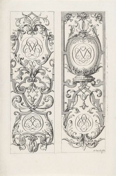
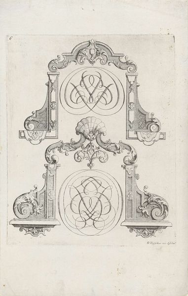
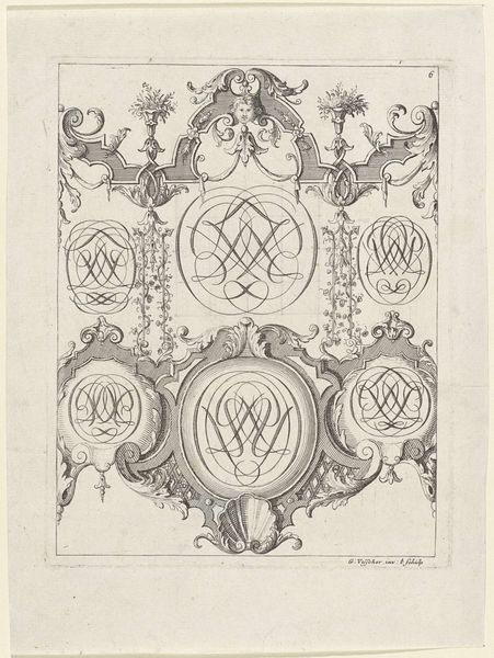
Curator: Here we have “Twee verticale ornamenten van bladranken en met monogrammen,” or "Two vertical ornaments of leaf tendrils and monograms," created between 1690 and 1710 by Gerrit Visscher. Editor: They strike me as quietly grand—like architectural drawings of frozen music, ornate and poised, from a bygone era of powdered wigs and stately dances. Curator: Indeed! These ink drawings, crafted with engraving techniques, exemplify the Baroque style. Visscher clearly emphasizes form through intricate linework, showcasing meticulous detail. The material execution speaks volumes about the artisanal culture of that period. Editor: You can see the layers upon layers, I wonder how many variations he would have made, and rejected, before committing to these final designs, cut to fit the page? Did Visscher also engrave them himself? Curator: Good question. The purpose wasn't art for art’s sake; they're design templates. Imagine a silversmith or a furniture maker using this to create something luxurious for an aristocratic client! They were essentially a highly valued type of pattern, offering flexibility for artisans, almost acting like blueprints for craftsmanship. Editor: I see it! And the monograms at the center become customisable hubs. It feels almost proto-mass production where the ornamental elements can be combined with specific client identifiers and needs. There's labor, materiality, and this interesting suggestion of early brand identity tied together in a seemingly simple set of ink drawings. Curator: Absolutely. Beyond just the technical skill and commercial intent, there is a dance of fantasy and practicality in each flowing flourish, an attempt to capture movement and life, really, with these inert lines. It hints at a world striving for harmony and idealization, cloaked, as Baroque art often is, with this underlying hum of mortality. Editor: In the making we can sense how form and function blur when art quite directly facilitates production while simultaneously pointing to cultural values. Each swirl holds both creative license and commercial considerations. Curator: And now it holds our gaze. Amazing isn’t it, how lines drawn centuries ago can still trigger new meanings. Editor: I'll look at that shell form in the bottom right a lot more intensely from now on! Thanks for that dive into materiality and more.
Comments
No comments
Be the first to comment and join the conversation on the ultimate creative platform.
More like this