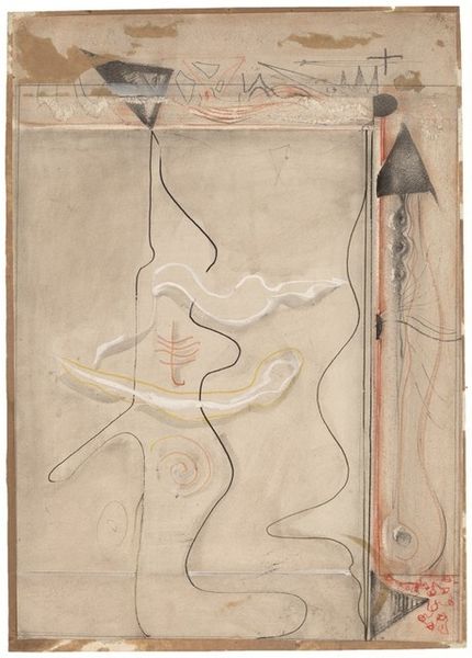
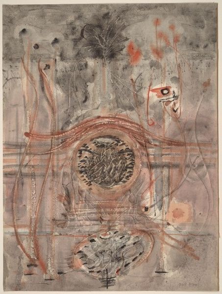
drawing, mixed-media
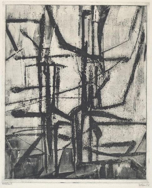
abstract-expressionism
drawing
mixed-media
water colours
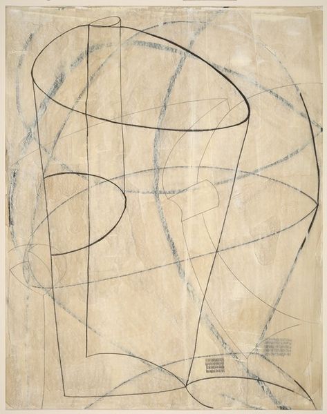
geometric
watercolor
Dimensions: overall: 56.5 x 39.1 cm (22 1/4 x 15 3/8 in.)
Copyright: National Gallery of Art: CC0 1.0
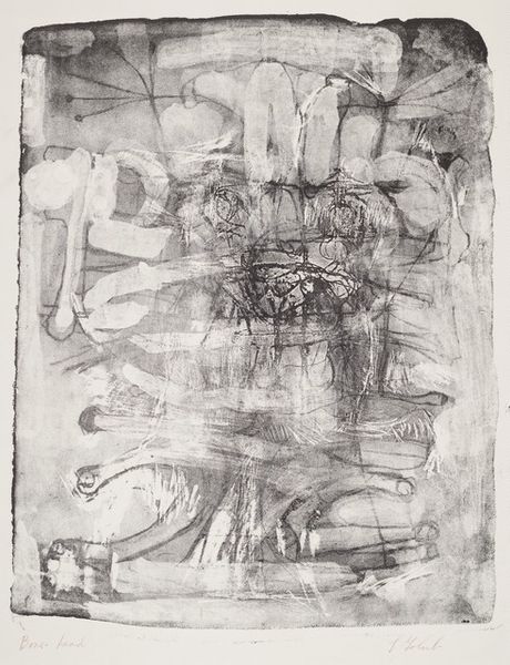
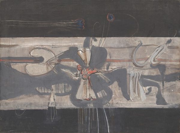
Editor: So, this is Mark Rothko's "Abstract Composition in Black, Brown, and Orange," likely from around 1944-1946. It’s mixed media, I think including watercolor, and has these very stark geometric shapes. It feels, I don't know...almost archaeological? Like we’ve unearthed some forgotten glyphs. What strikes you about this piece? Curator: You've nailed a key part, its timeless quality! I see it less as archeological and more… cellular, perhaps, or even something astral, cosmic. I feel the biomorphic shapes hinting at life and formlessness. Imagine yourself floating within that muted color field, weightless, suspended… Does the color palette evoke anything in particular for you? It’s a peculiar blend of earth tones and a burning orange, isn’t it? Editor: Yes, the orange circle is really intense, and contrasts heavily with the muted browns. The other shapes also have an ambiguous nature that brings about several feelings and sensations. It is unclear. Curator: Ambiguity, exactly! The lack of definition, that dissolving of form… Rothko’s on the cusp here, moving from these surrealist, almost figurative gestures, to his mature style of pure color fields. These “glyphs”, as you called them, are sort of remnants, echoes of a representational world he’s about to leave behind. Are they figures or purely abstract forms to you? Do you have a hunch? Editor: Hmm… maybe neither, or maybe both! They're in-between places, visually, which is compelling, and like the title tells us, it is an abstract "composition". So the shapes help form meaning to the piece. It seems very carefully orchestrated despite its abstract nature. Curator: Absolutely! It’s that tension, that "between-ness" that’s so powerful. This isn’t just random splatters. It's like Rothko's grappling with how much to reveal and how much to obscure. And you picked up on something key–that careful orchestration! It reveals its careful design more you engage with it, despite the artwork being abstract. It is almost musical in the visual "notes" the different elements create. This reminds me that art transcends time to create these intimate reflections. Editor: I see that now; thank you. It has opened my mind in that what I initially perceived changed significantly.
Comments
No comments
Be the first to comment and join the conversation on the ultimate creative platform.