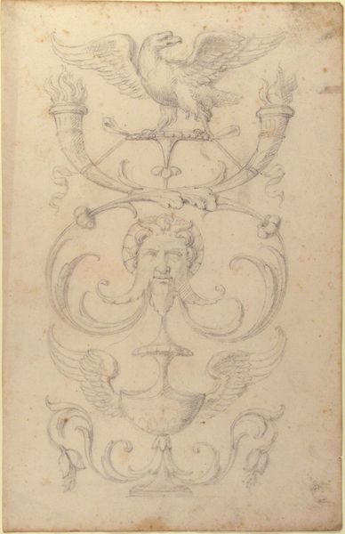
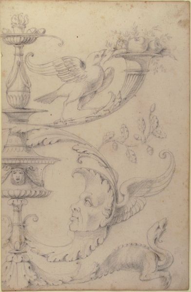
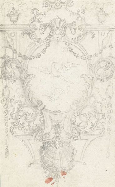
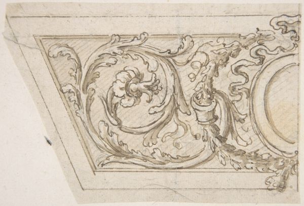
Drawing of a Grotesque after a 16th-century Decorative Relief. 1770 - 1830
0:00
0:00
drawing, print, pencil
#
drawing
# print
#
figuration
#
11_renaissance
#
pencil
#
grotesque
Dimensions: sheet: 13 7/16 x 8 11/16 in. (34.2 x 22.1 cm)
Copyright: Public Domain
Editor: This pencil drawing from between 1770 and 1830, titled "Drawing of a Grotesque after a 16th-century Decorative Relief," depicts two grotesque faces interwoven with decorative animal forms and foliage. I’m struck by the contrast between the severe expressions of the faces and the delicate, flowing lines of the surrounding ornamentation. How would you interpret this piece? Curator: The effectiveness of this drawing resides within its formal arrangement. Note the balance achieved between the human forms and the stylized avian and foliate motifs. The artist displays considerable skill in modulating the pencil strokes to delineate depth and texture, rendering what must have been a sculptural relief in a graphic medium. Does the implied asymmetry suggest something to you? Editor: The asymmetry feels deliberate. Perhaps to avoid the rigidity often found in purely symmetrical designs? Also, are there visual clues beyond what I mentioned regarding "delicate lines of surrounding ornamentation" to the composition being successful? Curator: Precisely. By avoiding perfect symmetry, the artist injects a sense of dynamic energy. Observe the curvilinear lines – the sinuous forms of the birds and the scrolling foliage create a visual rhythm that enlivens the entire composition, successfully. How might this contribute to the overall impact of the grotesque theme? Editor: I guess I had not considered it, but perhaps that visual rhythm works to counter, or at least complicate, the disturbing effect of the grotesque faces themselves. So form contradicts theme? Curator: It introduces a productive tension. The grotesque is traditionally understood as something jarring or disruptive, however here the drawing creates this tension which works, given it's current home, to further create dialog and inquiry on Renaissance forms and their rebirth in latter movements. We have demonstrated that an emphasis on the formal elements can illuminate a work’s complexities and its overall aesthetic power, even in a seemingly simple sketch. Editor: I see now that examining the formal arrangement – line, balance, rhythm – offers significant insight. I was focusing too much on my personal reading of the "grotesque". Thank you for your valuable expertise, Curator.
Comments
No comments
Be the first to comment and join the conversation on the ultimate creative platform.
More like this