drawing, typography, pen
#
script typeface
#
drawing
#
type repetition
#
hand-lettering
#
branded good
#
old engraving style
#
hand drawn type
#
hand lettering
#
typography
#
geometric
#
thick font
#
pen
#
golden font
#
word imagery
#
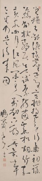
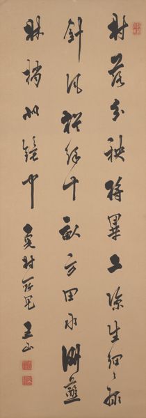
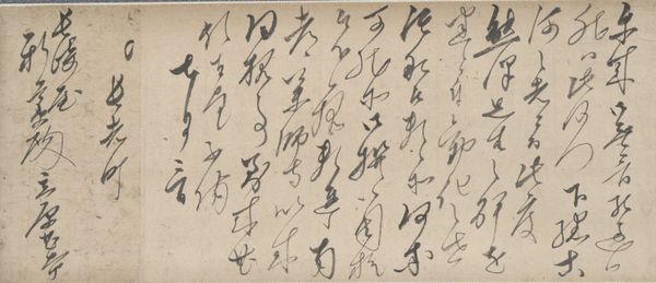
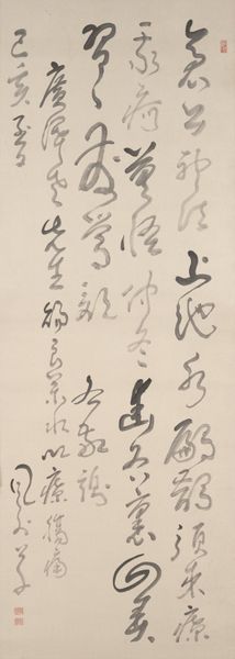
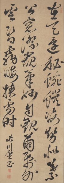
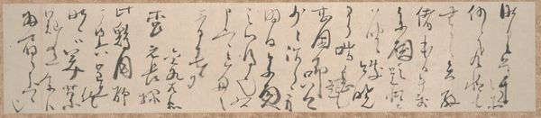
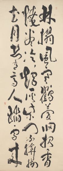
calligraphy
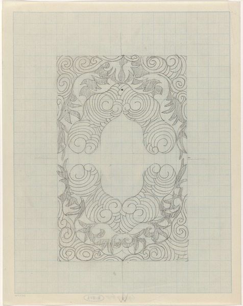
Dimensions: height 318 mm, width 203 mm
Copyright: Rijks Museum: Open Domain
Editor: Right, let's talk about "Letters A t/m M," a drawing by Jan Caspar Philips from 1737, over at the Rijksmuseum. The precision is striking – seeing these meticulously drafted letterforms feels almost mathematical, yet each has a subtle flourish. What am I missing? What jumps out at you? Curator: Missing? Nothing! You've nailed the initial paradox. It's that dance between rigorous structure and the breath of the hand that gets me every time. Look closer - the grid, yes, but those barely-there circles… ghostly guides. It feels like Philips is wrestling with control and letting the letter almost... become itself. Don't you think there’s a tension there, between design and a kind of organic growth? Editor: Definitely! Now that you point that out, it feels a bit like those botanical drawings, but with typography. I'm now noticing that some of the letters appear like architectural drawings or almost machine-like, and some more organic shapes. Curator: Exactly! It's architecture meeting nature, rationalism twirling with intuition. And thinking about the period – the Enlightenment! – this push-and-pull resonates. It’s more than just calligraphy; it's an encapsulation of its time! Makes you wonder about Philips, doesn't it? Was he a rigid rule-follower or a bit of a rebel doodler? Editor: Absolutely! Maybe a bit of both! The structure is neat, but then a flourish escapes, suggesting the potential to break free from constraints. These letters seem less about cold perfection and more about a sort of restrained expression. Thanks for sharing these details! Curator: My pleasure! And honestly, it's pieces like these that remind us that even something as seemingly functional as letterforms can hold so much story and so much human intention. Keeps things lively, eh?
Comments
No comments
Be the first to comment and join the conversation on the ultimate creative platform.
More like this