About this artwork
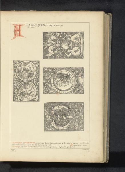
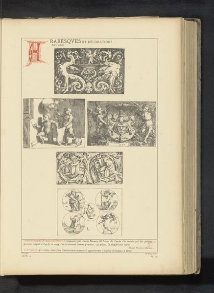
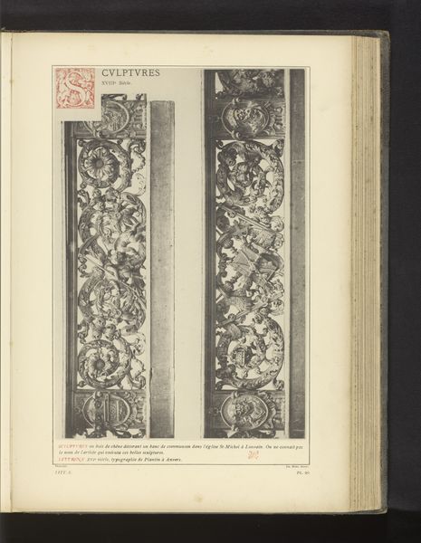
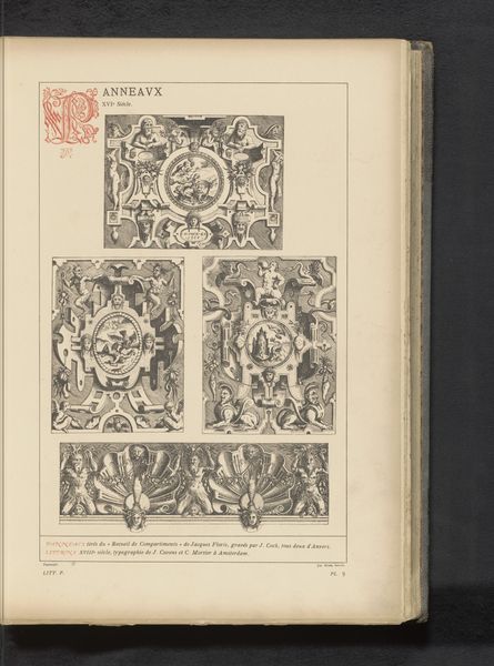
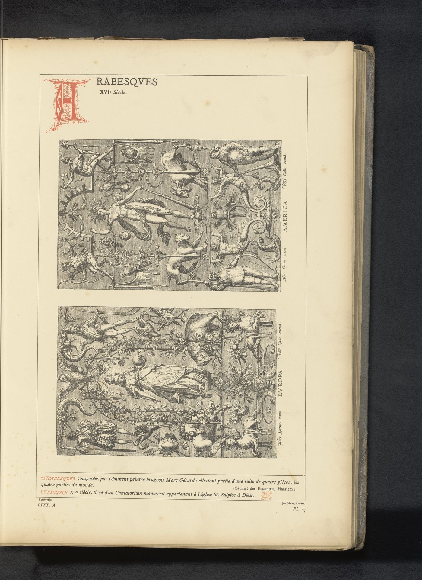
Editor: This is "Reproductie van twee ontwerpen met allegorieën van Europa en Amerika door Marcus Gheeraerts", made before 1880. It's a print, an engraving, and the intricate lines really catch my eye. What immediately strikes me is how different the compositions are for Europa versus America. How do you interpret this work, looking at the formal elements? Curator: Indeed. Note how the lines articulate the composition and depth, how they define the contrast. This is achieved via two contrasting design choices of the artist, isn’t it? Consider how the upper register, representing "America," presents a relatively sparse arrangement. Linear forms are placed strategically within the plane and across it; a much looser approach, a floating arrangement, where each distinct pictorial component holds its own ground. How does the artist convey “Europe”? Editor: Well, the composition for Europa appears much denser, more cluttered almost. The forms overlap considerably and seem heavier, grounded... chaotic in some way. It's much more compact. Curator: Precisely. Observe how the density generates a hierarchical structuring to our experience of the visual field. Your eye might navigate differently given these compositional distinctions. One section provides discrete linearity; the other superimposition. It speaks volumes to the intent, don't you think? A deliberate set of formal choices meant to engage us, formally? Editor: Yes, I can see that now. By focusing on line, density, and compositional choices, we can really delve into how the artist wants us to perceive the image. The stark contrasts in style underscore symbolic divisions through formal variance. Thank you! Curator: A useful formal consideration that can open avenues for further interpretation, always.
Reproductie van twee ontwerpen met allegorieën van Europa en Amerika door Marcus Gheeraerts
before 1880
Artwork details
- Medium
- print, engraving
- Dimensions
- height 344 mm, width 232 mm
- Copyright
- Rijks Museum: Open Domain
Tags
allegory
figuration
11_renaissance
line
engraving
Comments
Be the first to share your thoughts about this work.
About this artwork
Editor: This is "Reproductie van twee ontwerpen met allegorieën van Europa en Amerika door Marcus Gheeraerts", made before 1880. It's a print, an engraving, and the intricate lines really catch my eye. What immediately strikes me is how different the compositions are for Europa versus America. How do you interpret this work, looking at the formal elements? Curator: Indeed. Note how the lines articulate the composition and depth, how they define the contrast. This is achieved via two contrasting design choices of the artist, isn’t it? Consider how the upper register, representing "America," presents a relatively sparse arrangement. Linear forms are placed strategically within the plane and across it; a much looser approach, a floating arrangement, where each distinct pictorial component holds its own ground. How does the artist convey “Europe”? Editor: Well, the composition for Europa appears much denser, more cluttered almost. The forms overlap considerably and seem heavier, grounded... chaotic in some way. It's much more compact. Curator: Precisely. Observe how the density generates a hierarchical structuring to our experience of the visual field. Your eye might navigate differently given these compositional distinctions. One section provides discrete linearity; the other superimposition. It speaks volumes to the intent, don't you think? A deliberate set of formal choices meant to engage us, formally? Editor: Yes, I can see that now. By focusing on line, density, and compositional choices, we can really delve into how the artist wants us to perceive the image. The stark contrasts in style underscore symbolic divisions through formal variance. Thank you! Curator: A useful formal consideration that can open avenues for further interpretation, always.
Comments
Be the first to share your thoughts about this work.
