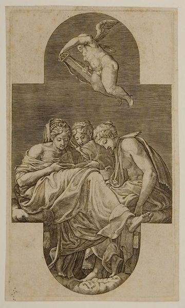
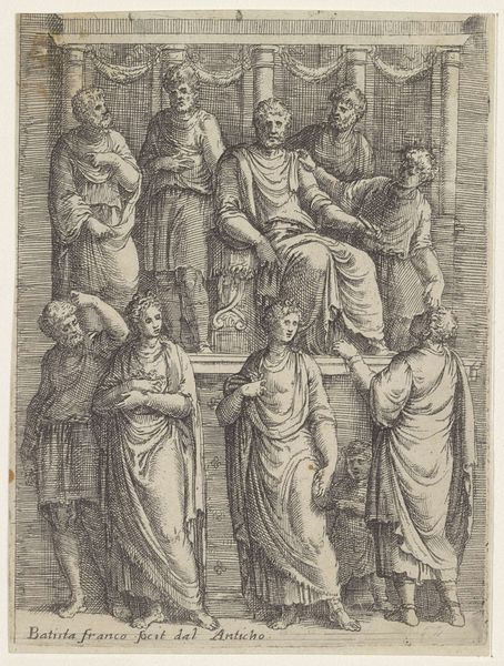
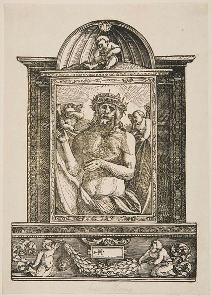
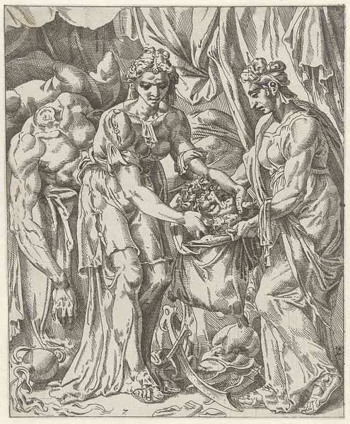
print, engraving
# print
#
figuration
#
history-painting
#
italian-renaissance
#
engraving
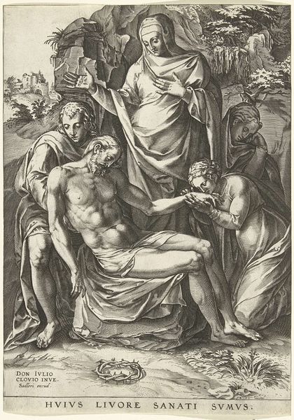
Dimensions: height 245 mm, width 176 mm
Copyright: Rijks Museum: Open Domain
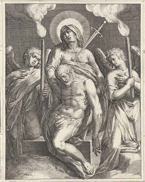
Curator: Immediately, I see somberness; it's all so meticulously rendered. The delicate lines seem to capture a quiet, almost sacred sorrow. Editor: Indeed. What we have here is “Kruisafneming”, or "Descent from the Cross", an engraving by Bartolomeo da Brescia, created in 1565, during the Italian Renaissance. Curator: An engraving—that explains the stark contrast, the precision of the line work. I’m drawn to the detail in Christ's musculature; it speaks of the labor and skill inherent in producing the print. The paper itself must have been carefully selected. What kind of production context are we considering for Brescia here? Editor: Let's consider this print as a commodity; its circulation enabled wider access to religious narratives and, importantly, helped disseminate artistic styles throughout Europe. But the image itself... it's a study in grief, isn't it? Note the Virgin Mary cradling Jesus, and the other figures each locked in their private lament. I see it as a reflection of communal suffering and empathy. The print allowed this display of emotions to reach a broad audience facing all kinds of different social issues at the time. Curator: Yes, but what about the craftsmanship that facilitates that reception? The way he models the figures, how the cross seems roughly hewn and weighty against the detailed figures—the textures alone must have taken weeks to execute. He wasn't just reproducing an image; he was transforming labor into meaning. Look how the light plays across the engravings - almost giving the image life beyond the moment that it depicts. The materiality allows for a kind of access to transcendence that a painted version maybe could not achieve at this time. Editor: The image is rife with contradictions, no? Intended for the masses, but steeped in an artistic language refined for an elite, educated viewership. What I find fascinating is how it blends accessibility with sophisticated compositional techniques; Brescia created an object accessible for devotion. It’s almost operating as propaganda in the wake of reformation ideas...it reinforces religious belief. Curator: An intriguing idea! This piece feels smaller than some of the iconic large oil paintings with similar thematics... but its portability certainly lends a powerful edge for the moment. I have newfound respect for Brescia's methods. Editor: It truly pushes us to question not just what we see but who it was made for, why, and with what means, thus broadening our cultural literacy around religion and Renaissance artistry. Thank you for adding so much nuance here today!
Comments
No comments
Be the first to comment and join the conversation on the ultimate creative platform.
More like this