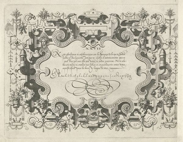
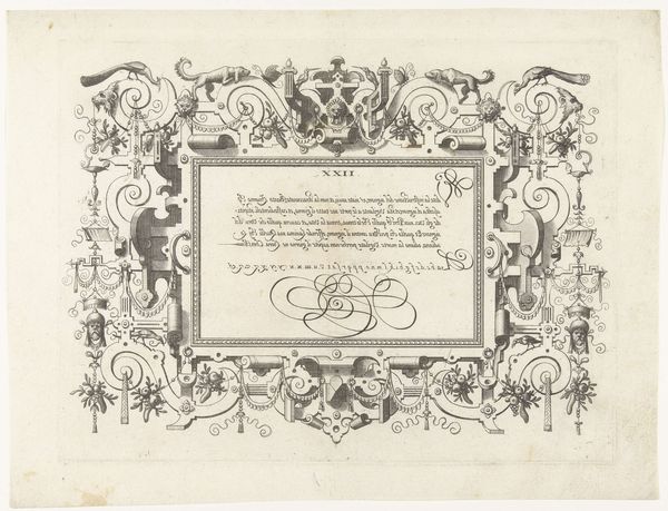
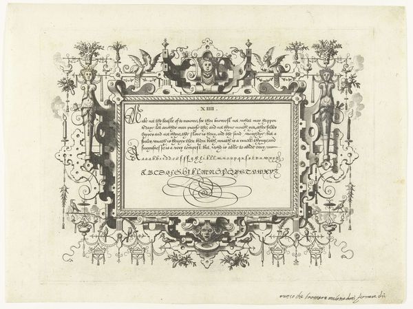
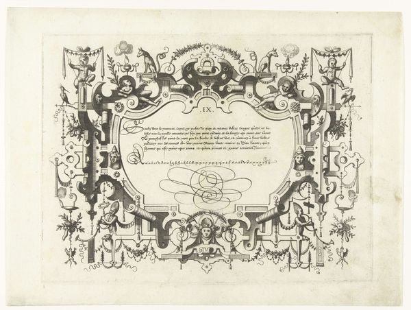
Cartouche met kalligrafie, bovenaan hangt een mascaron met horens 1569
0:00
0:00
johannesoflucasvandoetechum
Rijksmuseum
graphic-art, print, typography, engraving
#
graphic-art
# print
#
11_renaissance
#
typography
#
engraving
Dimensions: height 216 mm, width 283 mm
Copyright: Rijks Museum: Open Domain
Curator: Ah, yes, here we have a 1569 engraving titled "Cartouche met kalligrafie, bovenaan hangt een mascaron met horens," or, "Cartouche with calligraphy, topped by a mascaron with horns," by Johannes or Lucas van Doetechum. It’s part of the Rijksmuseum’s collection. Editor: Woah. Talk about ornamental! It's so busy, it's almost dizzying, like stepping into some baroque clockwork fantasy. Dark and detailed—I feel like I’ve found a page from a spellbook or something. Curator: Exactly! Cartouches like these were incredibly popular at the time. Think of them as the Renaissance equivalent of website banners or elaborate certificates. It really shows how text itself could be elevated to a form of art. Consider that this was a period of intense interest in classical forms and humanist ideals. Editor: You can definitely see the classical inspiration in the little winged creatures and the stylized garlands, but then there's this grotesque mask up top. What's with that grumpy face overlooking everything? Curator: The mascaron? Well, those horned faces, often grotesque, served to ward off evil, to signal strength, and even to inject a bit of humor. They’re visual guardians of the text, almost like gargoyles on a building. The inscription itself… looks to be something of a proverb, perhaps on the corrupting nature of flattery? Editor: Hmm, "Flattery and dead flies spoil the apothecary’s ointment…” Something about glory and infamy? Ominous… I like it! Curator: Precisely! Prints like these served multiple functions. They were aesthetic objects, educational tools for budding artists to learn technique, and sometimes, carriers of sophisticated intellectual concepts. And don’t forget the importance of typography. Good lettering was crucial in commerce and statecraft. Editor: So much to take in, from the winged allegories down to the stylized alphabet. It's almost overwhelming—beautiful but claustrophobic! Curator: It reflects a society wrestling with new forms of knowledge, artistic expression, and political discourse. In a way, it reminds us that even the most visually elaborate things were underpinned by pragmatic concerns. Editor: This makes you consider how even our Instagram layouts will be analyzed one day for reflecting current social issues. Makes my head spin! Curator: Well, hopefully this gave a bit of context and perspective on this piece! Thanks for joining. Editor: Absolutely! My imagination is buzzing, thank you for enlightening us.
Comments
No comments
Be the first to comment and join the conversation on the ultimate creative platform.
More like this