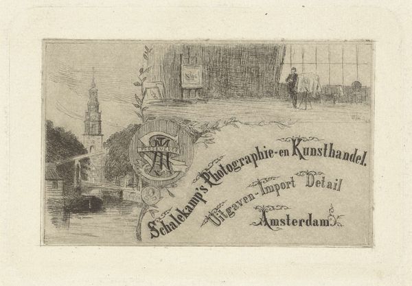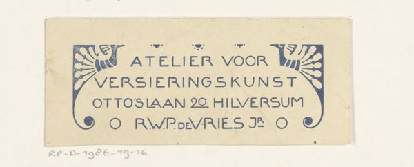
Ontwerp voor een briefhoofd van Motshagens handel in apotheek- en drogisterijbenodigdheden 1884 - 1952
0:00
0:00
drawing, graphic-art, paper, ink
#
drawing
#
graphic-art
#
art-nouveau
#
paper
#
ink
#
line
#
cityscape
Dimensions: height 127 mm, width 208 mm
Copyright: Rijks Museum: Open Domain
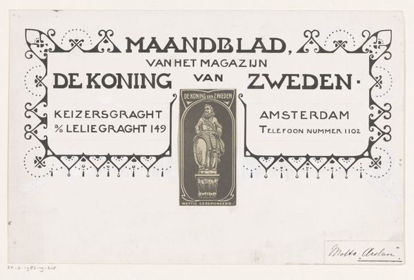
Curator: This charming drawing, titled "Ontwerp voor een briefhoofd van Motshagens handel in apotheek- en drogisterijbenodigdheden," dates from 1884 to 1952 and is credited to Reinier Willem Petrus de Vries. It's an ink drawing on paper, a design for the letterhead of a pharmacy supply business. Editor: It's got this really sweet, almost innocent feeling about it, even though it’s essentially an advert. The repetition of lines is striking; the window panes create this subtle vibration, which contrasts with the rigidity of the lettering. Curator: That innocence probably comes from its embrace of Art Nouveau, although quite a restrained version, which was all about injecting beauty into everyday design. I see so much of the style through the flowing, curved lines, notably surrounding the upper edges around the company building illustration and bordering around various medicine containers. And I feel how it symbolizes a desire to escape the industrial age through craftsmanship. Editor: Exactly! The little apothecary bottles flanking the edges—those aren’t just containers; they’re ancient symbols of healing and alchemical transformation. Juxtaposed with the functional typeface makes the entire advertisement a bit like an illustration out of some ancient remedy manuscript. This company certainly seemed keen to associate itself with those symbolic links to both commerce and magical transformations. Curator: Absolutely! And the cityscape in the background? That reminds us that this business isn't some abstract entity, but deeply embedded in the daily life and community, serving real people. I wonder if they also understood the semiotic function of such imagery? Editor: Well, whether they realized it or not, it’s an appeal to reliability, tradition and hometown trust. All packaged in this eye-catching and very accessible design. It is like a cultural snapshot into their marketing techniques. The business address is a final and perfect example, I can only imagine it led to great recognisability among its customer base! Curator: It also encapsulates a moment of visual optimism in early advertising – a time when commerce was presented with artistry and an unstated promise. Editor: A small piece, but surprisingly revealing! It prompts a wider imagining of their market approach as a seller to their clients. Curator: Absolutely, this tiny letterhead blueprint offers a great insight to the values it promoted at the time.
Comments
No comments
Be the first to comment and join the conversation on the ultimate creative platform.
