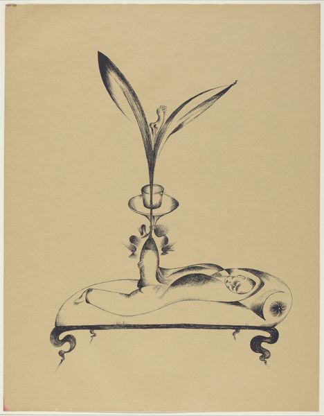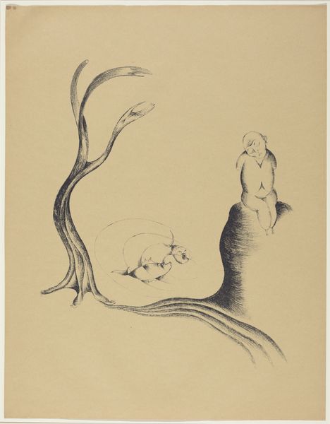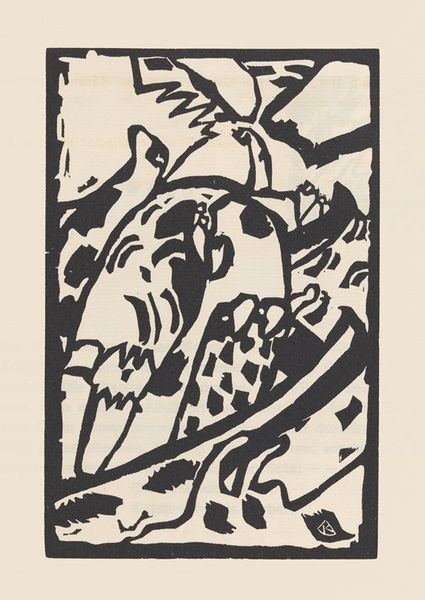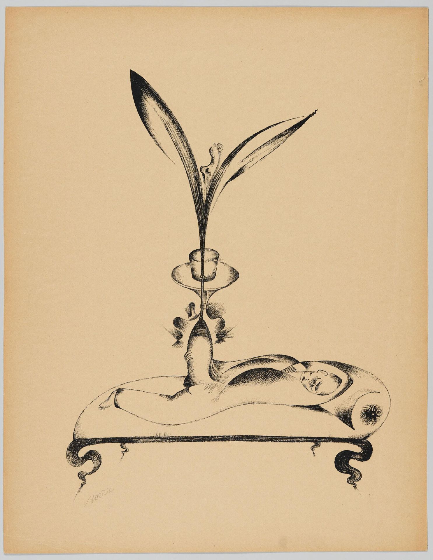
1920
Friendly Dream
Listen to curator's interpretation
Curatorial notes
Editor: This is Heinrich Hoerle's "Friendly Dream". It's a monochromatic drawing, probably ink on paper, and it feels very surreal and dreamlike. What compositional elements stand out to you? Curator: The linear quality is quite striking. Note how Hoerle uses line weight to define form and create visual interest. Also, consider the interplay between positive and negative space. What is your reading? Editor: I noticed the stark contrast between the defined figure and the empty background. It almost feels isolating. Curator: Indeed. The artist's strategic use of line and form isolates the figures, drawing attention to their symbolic relationship. The starkness amplifies the dreamlike nature. Editor: That's fascinating. I'll definitely be looking at line weight and space differently from now on. Curator: Excellent. It is essential to observe how formal elements contribute to an artwork's overall meaning.